The house that taught me
In my early twenties, I bought a house in Washington’s Capitol Hill neighborhood—my first home, steps from the Capitol, Union Station, and, an eclectic mix of restaurants and shops. I still remember the warm spring afternoon just after the closing ceremony, using my own keys for the first time, unlocking the front door, and stepping into a space that was finally, completely mine.
On paper, it was a great house: two bedrooms, two baths, just over 1,400 square feet. Compact, manageable, perfect for my single years. Walking in, you were greeted by a wide-open living and dining area, unusual for a Capitol Hill brownstone and undeniably good for entertaining. I loved it. Family and friends did too.
What took about a year to sink in was that many of the design choices during a previous renovation that made the house stand out during showings—the very things that caught my eye—slowly revealed themselves as unworkable once fully settled in.
Not an Insta filter … it looks like that because the photos were film
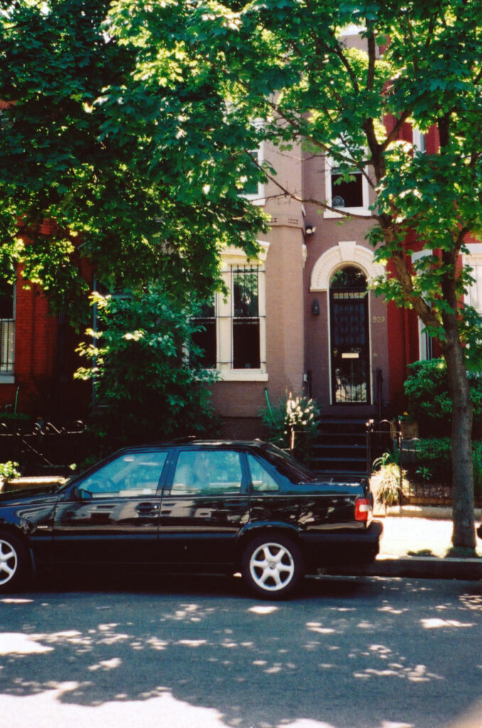 Front of the house and my old Volvo
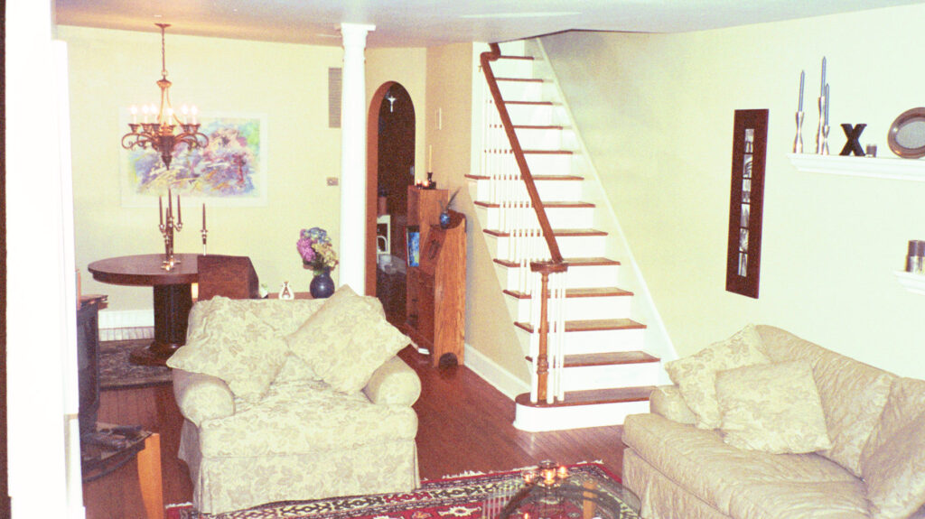 Entering you were greeted with open living and dining room
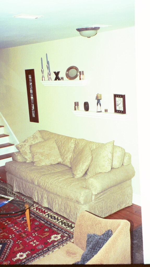 Capital Hill House
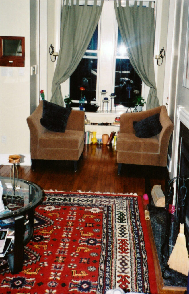 Entering you were greeted with open living and dining room
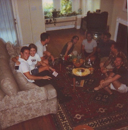 It was a great space for entertaining …
 … though it took a while before I could afford chairs
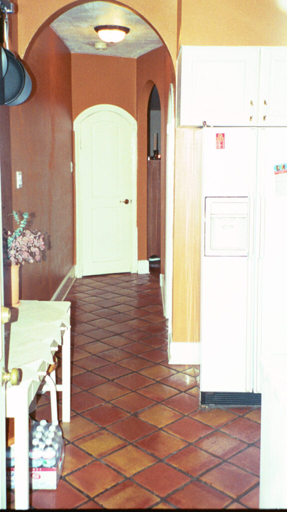 Long narrow hallway isolated the kitchen
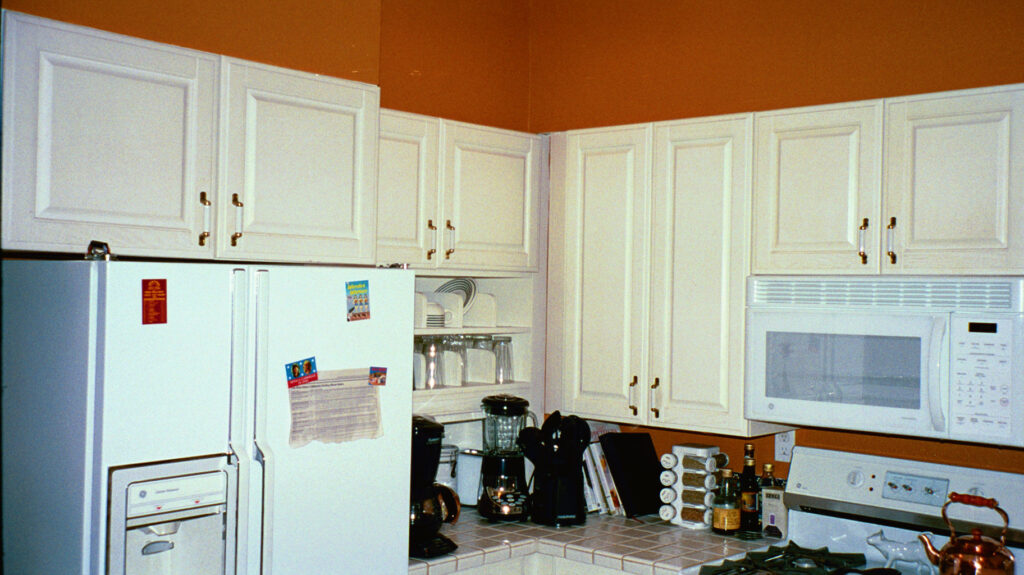 Even for DC it was a tight kitchen
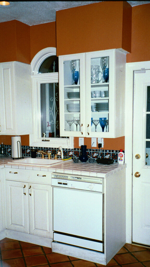 I hadn’t learn to cook yet so it was fine
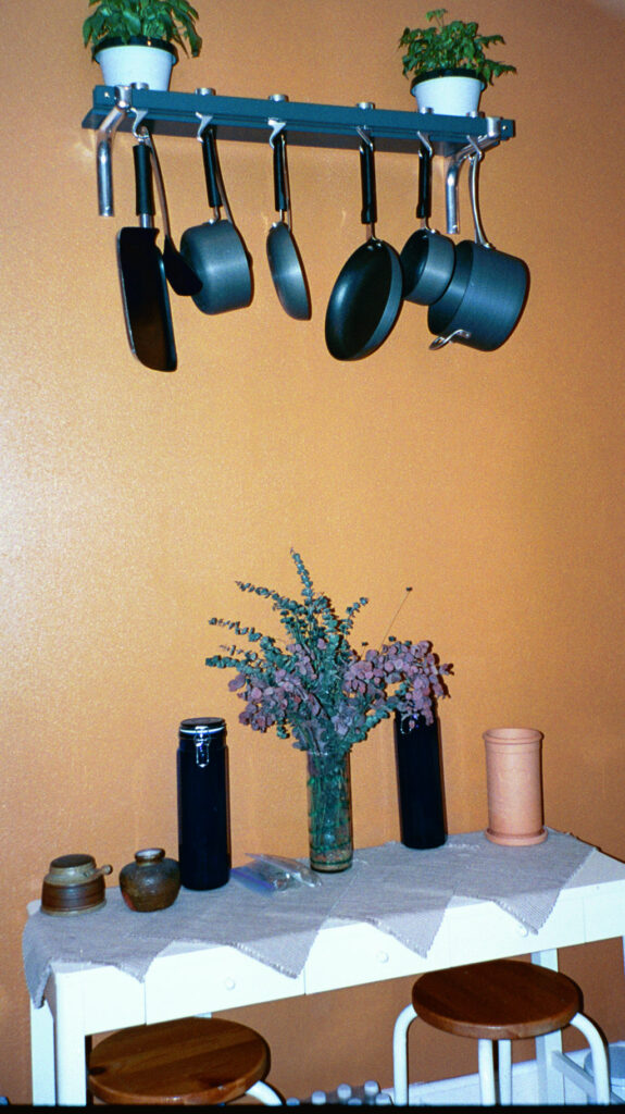 Unused pots hanging above my improvised island
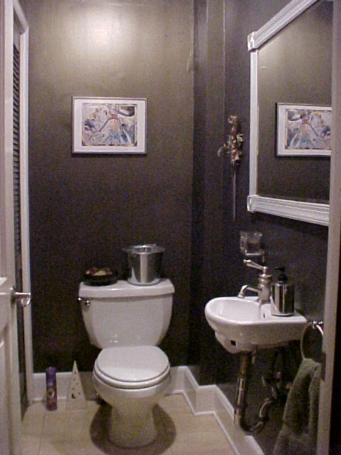 Moody powder room with my favorite “half a house” sink
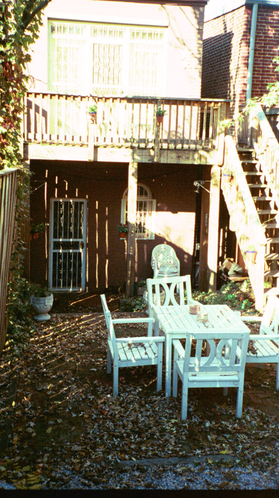 Perfect backyard for spring and fall entertaining
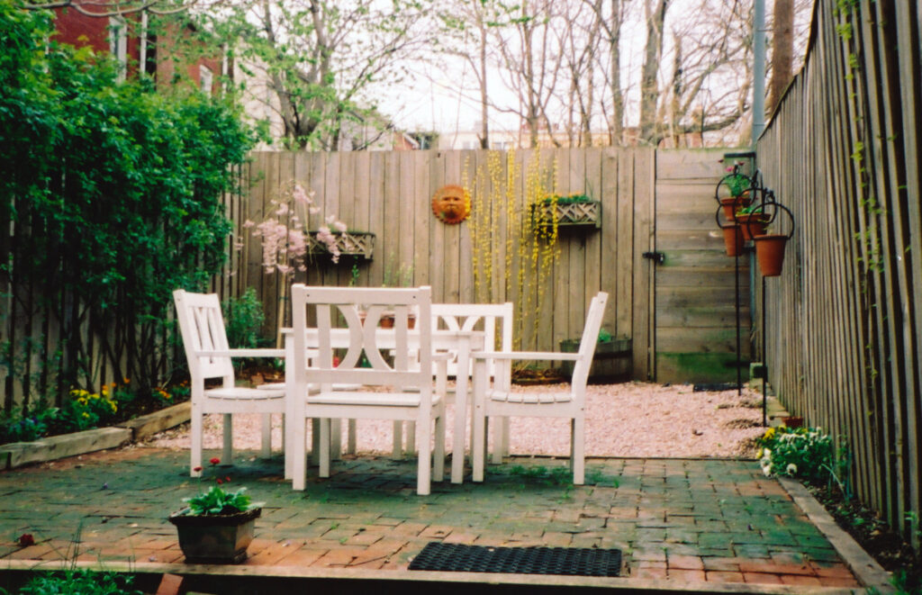 Perfect backyard for spring and fall entertaining
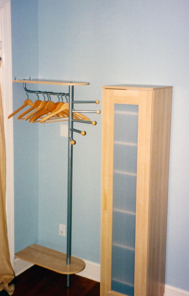 Problems upstairs: no closet in the guest room
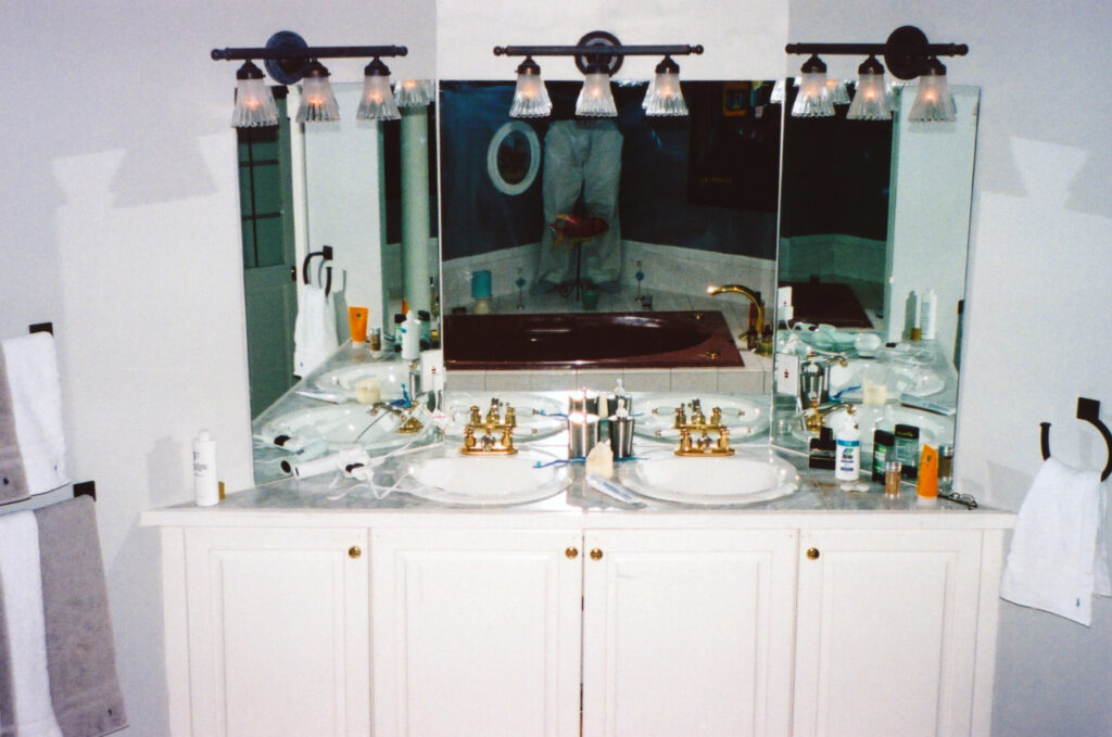 Problems upstairs: primary double sink at 45° angle wasted sq ft
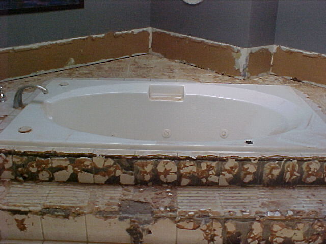
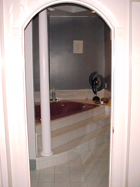 Problems upstairs: giant mauve platform tub, no shower in primary
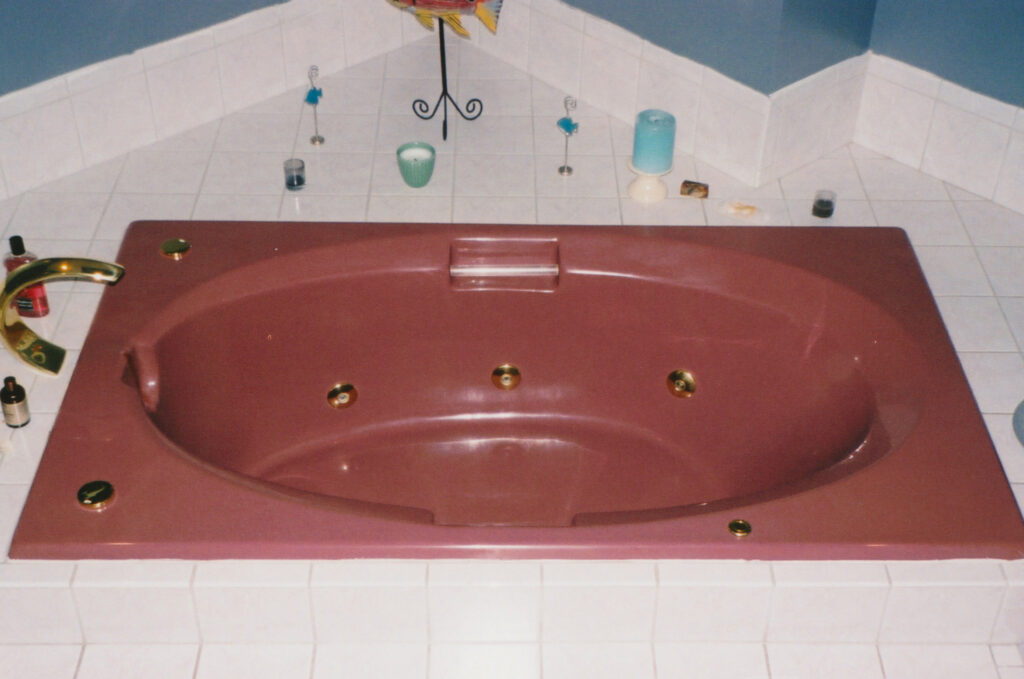 Problems upstairs: giant mauve platform tub, no shower in primary
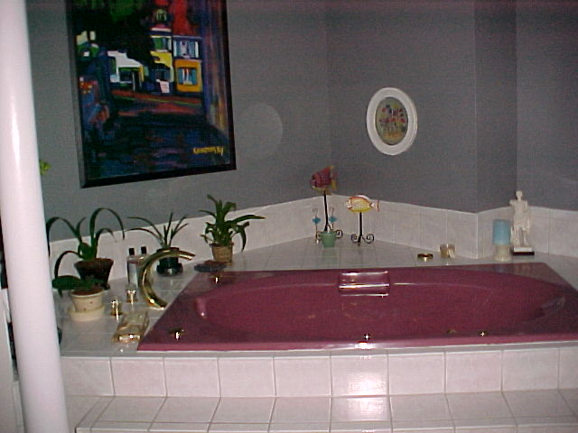 Problems upstairs: giant mauve platform tub, no shower in primary
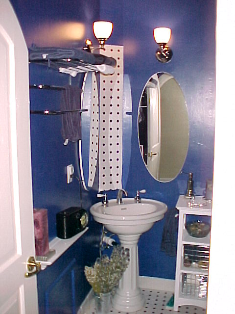 Guest Bath wasn’t private, only shower in the house
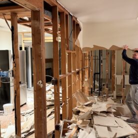
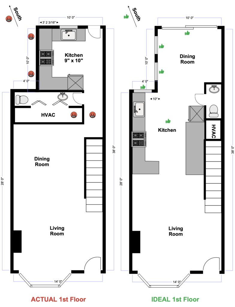
The problem revealed itself during parties—because everyone eventually ends up in the kitchen. And this kitchen, tucked into the very back of the house, was barely nine-by-ten feet, far less room for people with cabinets and appliances filling the perimeter. It was cut off from the rest of the house by a long, narrow hallway, turning its back on the open living and dining space. That separation was enforced by an awkwardly shaped powder room—you genuinely had to turn sideways to get around the sink—and a full run of HVAC equipment, including a pre–World War II Amana furnace that roared to life every winter, a sound guests routinely mistook for an aircraft crash landing on nearby Massachusetts Avenue.
The fix was obvious, even then. The HVAC and power rooms belonged under and behind the stairs. Eliminating that long, awkward hallway would have immediately reclaimed usable square footage—and in a small house, converting hallway into useable space is almost always the right move if you can make it.
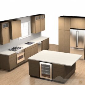
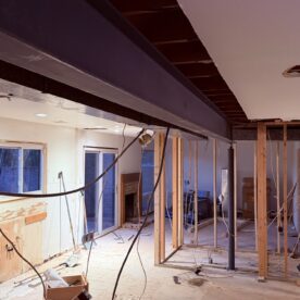
The more expensive—though much needed—change would have been relocating the kitchen to the center of the house. Because the rear of the house faced south, moving the kitchen to the center would have moved light-blocking cabinets into shared interior walls, freeing up valuable exterior walls for additional windows and a large glass slider. Shifting the dining room to the back would have drenched sunlight across the entire first floor.
The result would have been a significantly larger, more functional kitchen while preserving a full-size dining room. Combined with new windows along the southeast wall and near the kitchen sink—and the removal of unnecessary center walls—light would have been pulled deep into the interior, brightening the house from back to front.
Flooding the space with sunlight via a relocated, larger kitchen
Upstairs: a masterclass in what not to do
Touring the house with my real estate agent, my first impression of the primary suite was simple: Wow. For downtown living, it felt enormous. Entering the primary bedroom, you were greeted by a giant platform jacuzzi tub flanked by Roman columns. Dramatic? Absolutely. Opposite that sat a pair of double sinks—the only house on Capitol Hill in my price range with double sinks, which, at the time, felt like the height of luxury.
Even on that first walkthrough, I knew the color palette was… questionable. A mauve tub paired with a matching toilet didn’t exactly feel authentic, and the whole Roman Colosseum aesthetic was undeniably over the top. Still, the drama was captivating. It made an impression, and at that stage in my life, impressions mattered.
As a first-time homebuyer, I didn’t yet have the experience to recognize problems that now jump out immediately. The most obvious one? You had to walk through the bathroom to get to the bedroom. This works fine until someone is—let’s say—occupying the throne when you’re trying to get dressed and leave the house. There were also two closets, but each had sacrificed much of its storage to accommodate a separated washer and dryer—one machine per closet, absorbing much-needed space for my clothes.
The bigger issue, which revealed itself over time, was what I now consider the crown jewel of all design mistakes: 45-degree angles in a small space. The massive platform tub and diagonal walls devoured precious square footage, while the Roman columns cast shadows and blocked natural light from the room’s only window. And in all that theatrical excess, there was no shower. I enjoy a good soak—maybe two to four times a year. I shower at least twice a day. It didn’t take long to realize the mistake in that math.
Let me pause here to clarify something: I have a deep dislike of 45-degree angles and unnecessary hallways in small spaces. They consume square footage and rarely give anything back. Slightly more controversial, I’m also not a fan of walk-in closets for the same reason. Some of the most functional closets I’ve ever had were long, linear, reach-in closets—like the eighteen-foot run in my 1978 colonial in Bethesda. No awkward corners. No wasted volume. Just 100 percent usable storage, easy access, and more square footage left in the bedroom itself—enough to carve out a private, relaxing seating area, even in a modestly sized townhouse.
How the second floor should have been designed
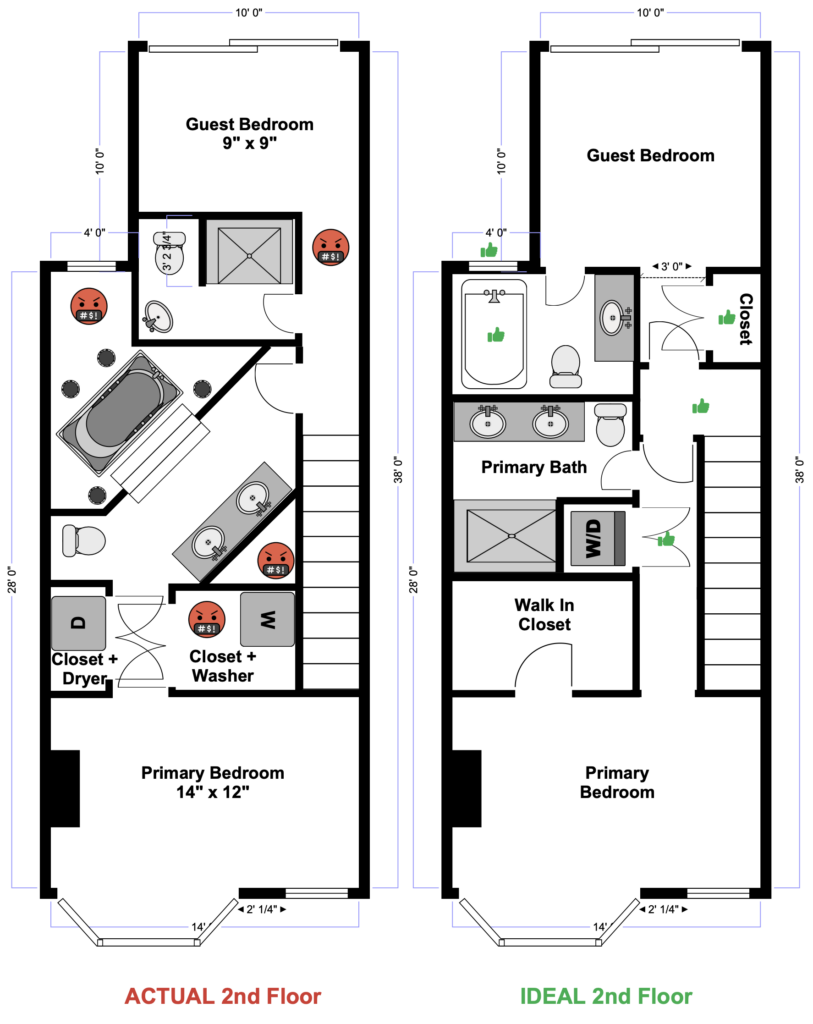
The better solution was clear—at least on paper
The second floor should have been squared off and equalized. Two bedrooms of comparable size, each with its own properly proportioned bathroom and real closets. No diagonals. No gymnastics required to reach a window. The guest bathroom could have taken advantage of the central window, with a soaking tub and shower combination placed directly beneath it and a proper vanity that allowed guests to spread out their things. The primary bathroom would retain the double sinks but gain a generous walk-in shower, making it far more functional for everyday use. A single, same-sized walk-in closet becomes possible by shifting the door a few inches and eliminating the unnecessary hallway that once cut the space in half.
Again, I’m generally not a fan of hallways, but in this case one would have added real utility. A small landing at the top of the stairs would have provided a place to pause and orient yourself—while also making it far easier to move furniture into the house. A short wall there would have been the perfect spot for a painting, paired with a wall sconce for ambient light.
A straight hallway leading to the primary bedroom would have allowed people to enter and exit without disturbing someone using the bathroom. Locating a stacked washer and dryer along that run would have improved closet layouts and made laundry accessible without turning the bathroom or bedroom into a thoroughfare. All of that functionality could have been gained simply by eliminating the 45-degree angles.
Learning to work with constraints
The budget, however, had other ideas.
So I started where I could: paint. It became my first real design weapon. I leaned into darker, moodier colors that were fashionable in the Northeast’s urban design consciousness at the time—deep burgundies and emerald greens paired with warm-toned hardwood floors. These moody interiors were common in established urban neighborhoods like Georgetown, Boston’s Back Bay, and New York’s Upper East Side, and they felt appropriate for the era of the house. I borrowed heavily from that palette, using color to give the rooms weight and intention without touching the structure.
Some constraints, though, were harder to overlook. The terra-cotta tile in the kitchen—far better suited to the desert Southwest—was an unfortunate choice I had to live with. Rather than fight it, I found a burnt copper tone to help anchor the space and make the floor feel less jarring. Not perfect, but closer to coherence than surrender.
I did manage to scrape together enough budget to tackle the worst offender upstairs: the mauve tub and matching toilet. Those went. In their place, I installed a more period-relevant finish—black-and-tan one-inch square tile. Simple, graphic, and restrained. It wasn’t flashy, but it respected the house far more than what I inherited.
That house taught me something I still carry forward: good design isn’t about how much you change—it’s about knowing what to change, and when to wait for a bigger budget. It’s also where I learned to see space functionally, and to recognize the long-term consequences of expensive but poorly considered remodels. I only wish I’d had the budget back then to fix it properly—not just for myself, but for the next generations of owners / stewards.
Did make some changes .. no reveal photos, sorry film was expensive!
 Removed the tile from the platform tub
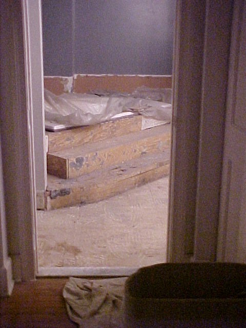 Removed the tile from the platform tub
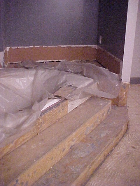 Didn’t have budget to remove the platform
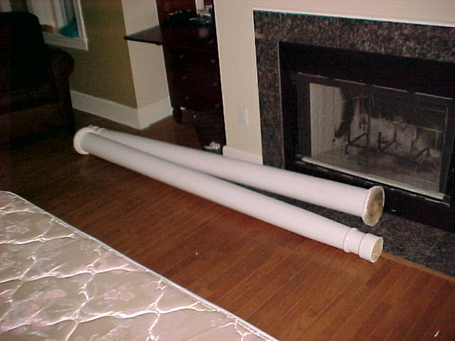 Roman columns in the primary bedroom
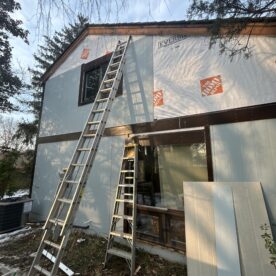
 Not a fan of living throug construction
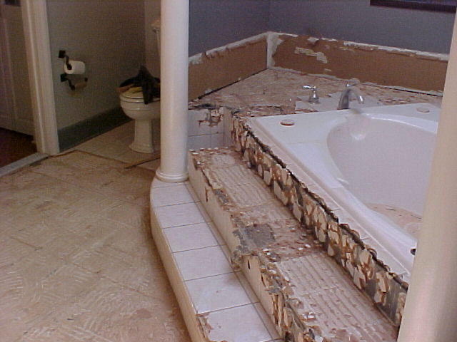 Removed the tile from the platform tub
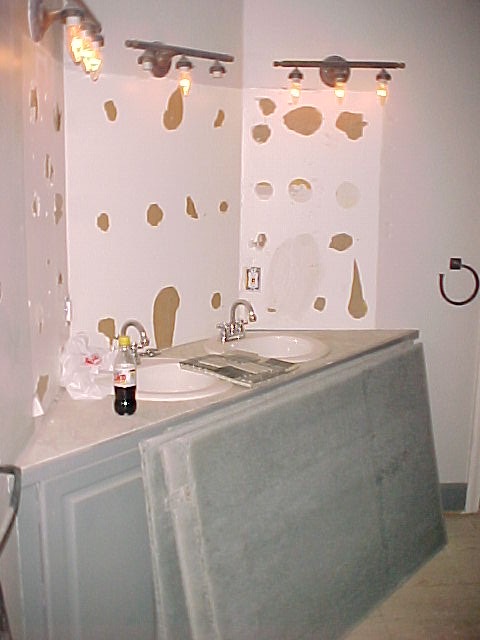 Not budget to remove 45° angles
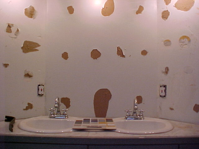 Not budget to remove 45° angles
What’s Next – Chapter 4
The lessons from Capitol Hill didn’t disappear—they sharpened. In Chapter 4, I move from hindsight to decision-making, applying those early lessons to the present. This is where ideas that once lived only on paper become real options.
I explore first-floor design strategies that balance light, flow, and structure: a kitchen that truly anchors the house, and the impact of introducing one or two structural beams. Each choice is evaluated not just for how it looks, but for how it shapes daily life—circulation, light, and the way rooms are actually used.
This time, the budget is real, the constraints are known, and the decisions are intentional.