Landing in Sydney
I moved to Sydney in the early 2000s for work, assuming it would be a short stint. Once it became clear I’d be there for a few years, I did what any optimistic novice would do: jumped headfirst into Sydney’s frenzied housing market—without fully understanding what I was getting myself into.
Between the City and Sea
My first instinct was Bondi beach. That fantasy lasted exactly as long as it took to picture a daily commute downtown to my job at the Commonwealth Bank. So I did what every expat did before Google Earth: unfolded a paper map, grabbed a push pin—physical, not digital—and aimed for the bullseye, smack between the Opera House and the Pacific ocean.
And in the middle were neighborhoods like Elizabeth Bay, Paddington, Edgecliff, and Woollahra—collectively known as the Eastern Suburbs—defined by Art Deco architecture, polished streetscapes, leafy parks, and yacht-filled marinas. Imagine picking up San Francisco’s Nob Hill and dropping it between Beverly Hills and Santa Monica. Hilly, sunny, pristine, highly refined. It felt aspirational.
In Sydney, selling houses is a professional sport and I hadn’t been to practice in a while. I showed up to several on-site auctions only to lose out on every single one. Most sold for twice my max price, at price points that would shock most New Yorkers. Aspirational awkwardly arrived at absurd.
Discovering the Balmain Peninsula
That’s when I turned my attention west—just across Darling harbor—to the Balmain Peninsula.
Exploring Balmain, the difference was immediate. Historically rugged and working-class—a quality that, as an ex-Pittsburgher, was oddly comforting—it comes across as an urban village with an attitude: bohemian at heart and refreshingly uninterested in competing with the glamour of the Eastern Suburbs.
Historically, Balmain was one of Australia’s premier industrial centers, a gritty blue-collar neighborhood defined by massive waterfront factories, shipbuilding yards, and even a deep-shaft coal mine. Its transition to a prestigious residential enclave began in the 1960s as industry moved away, leaving behind historic sandstone cottages that were increasingly prized for their proximity to the city and hills that provided sweeping views of the harbor and downtown.
Today I would say it’s highly comparable to New York’s Brooklyn Heights. Both are situated on historic waterfront peninsulas with a mix of grand 19th-century architecture and smaller cottage-style homes. Only a short ferry ride away from global financial districts, both have transitioned from industrial/maritime roots into leafy residential enclaves yet both have retained their authentic old village cultures.
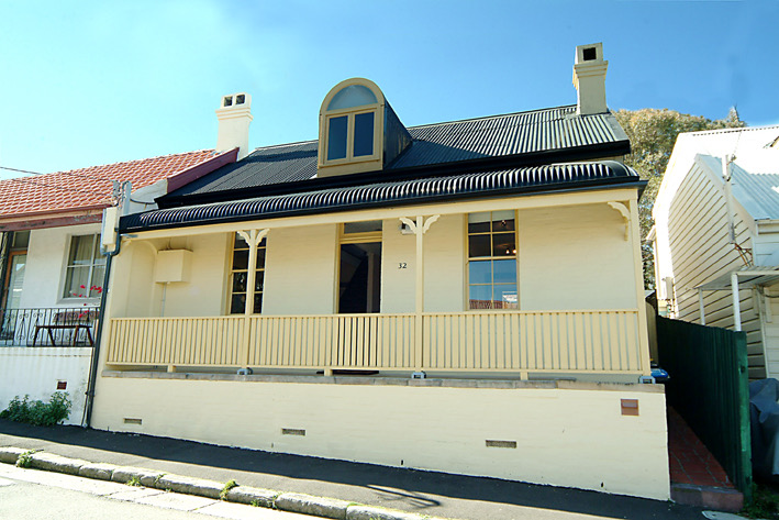
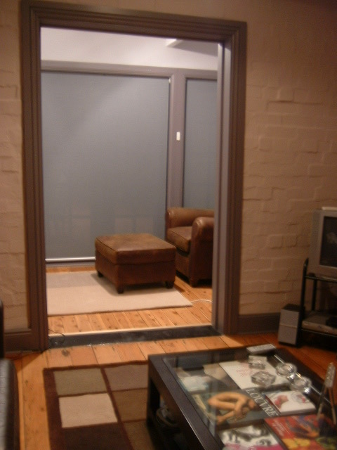
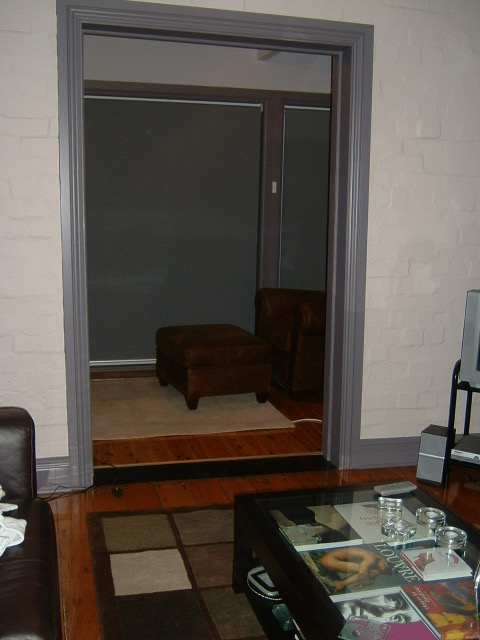
Balmain Peninsula just west of Sydney’s Iconic Skyline
 Balmain Peninsula just west of Sydney
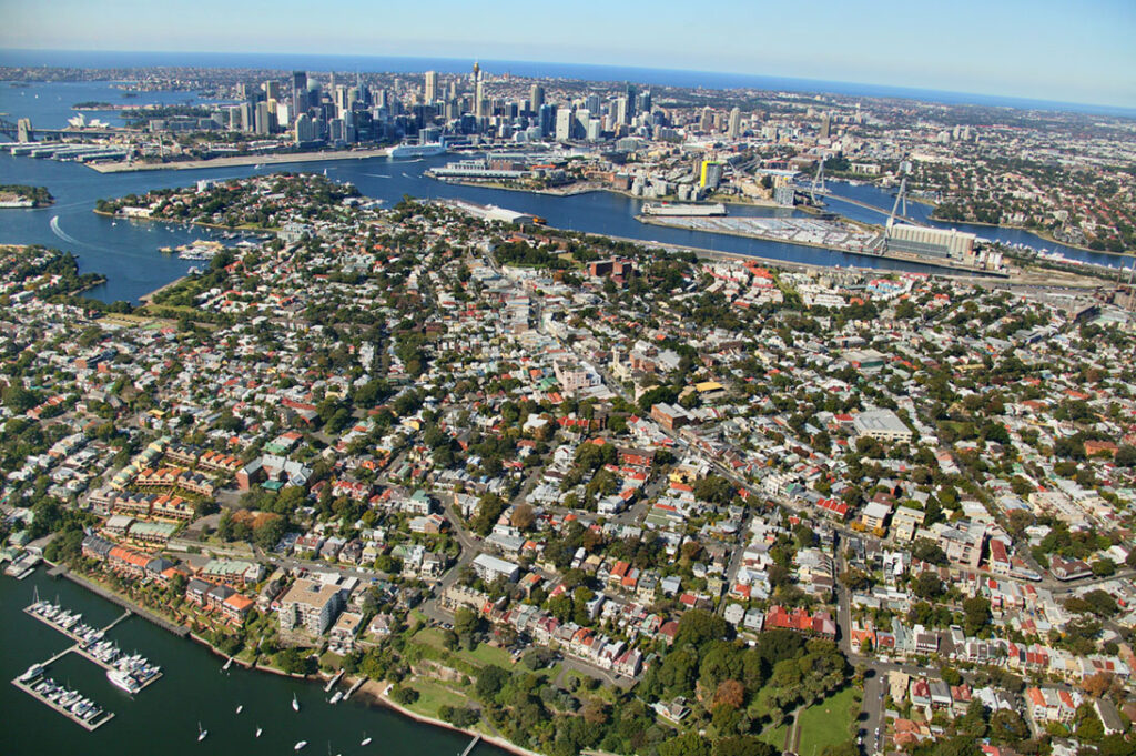 Housing in central Balmain Peninsula
Tiered Over Time
That’s where I found it: a double-fronted sandstone worker’s cottage, built in the mid-1800s for laborers in the local shipyards and factories.
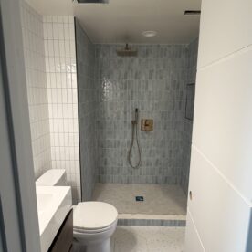
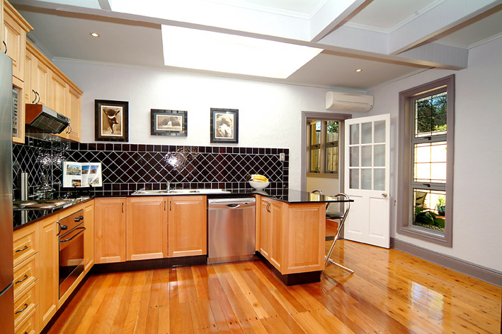
Originally a simple two-room house, it was built before indoor plumbing and had been expanded both backward and upward over time as modern amenities—like plumbing and electrical—became living standards. A rear addition pushed the footprint back, adding a small den behind the living room and converting what was once an outdoor “lean-to” kitchen—a basic, partially covered structure used for cooking over open fires before modern kitchens were moved inside. A single, full bathroom—tucked all the way at the back of the house behind the kitchen, which likely started as an outhouse, served the entire home.
Above the original rooms, a former loft had been converted into two bedrooms, reached by a steep staircase where no two steps were quite the same size—an architectural detail that ensured late-night trips downstairs to the only bathroom were never boring.
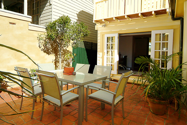
What ultimately sold me was the backyard: north-facing (which, in the Southern Hemisphere, means sun), perfectly suited to Sydney’s semi-tropical climate. Throwing open the doors from the den and kitchen you could move effortlessly between indoors and out, making the house much feel larger than it was.
My Balmain Peninsula Sandstone Cottage
Beyond Paint
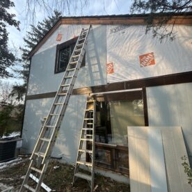
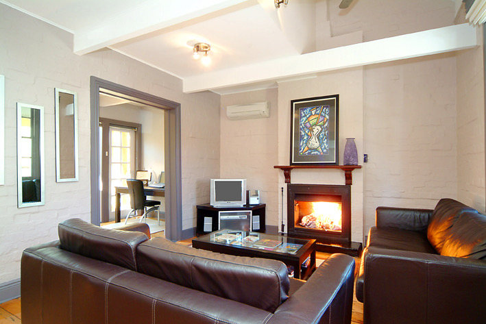
Even during the tour, I could tell the house had good bones—it just needed some paint. Or so I thought at the time. Winning the frenzied auction came with an immediate realization: I was now at my absolute max budget, which meant the renovation well was dry. After moving in, it became clear improving the space to feel like home would require far more than a weekend, a few paintbrushes, well-meaning friends, and a six-pack of Victoria Bitter. Creativity wasn’t optional—it was the only path forward.
The problem, in a nutshell, was the surfaces. There was no consistency of texture across ceilings, walls, or floors—not even within the same room. The house managed to showcase four ceiling types: wood cladding, smooth plaster, popcorn, and—my personal favorite—plaster capped with cheap, overly ornate plastic crown molding straight out of Barbie’s Dreamhouse.
Walls offered no relief. There were four competing finishes: exposed sandstone, plaster, wavy stucco, and what I can only describe as British barnyard—a crisscross lattice woodwork pattern on top of plaster. Flooring added another layer of confusion: hardwood and tile on the first floor, painted makeshift wood stairs heading up, and carpeted bedrooms above. As if all of that wasn’t enough, the house also featured six different molding profiles, occasionally colliding mid-wall as though the builder had simultaneously run out of materials and restraint.
To complete the ensemble, wildly different color palettes were splashed across nearly every surface, ensuring that no material—or room—felt remotely related to the next.
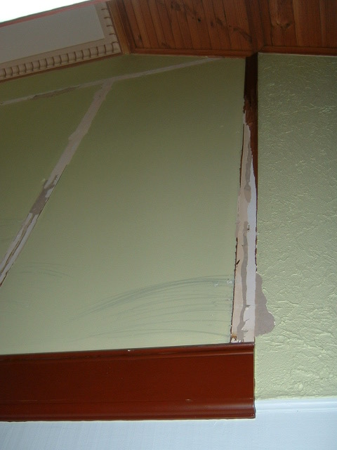
The cumulative effect was dizzying. Just inside the front door, looking up revealed the magnitude of the mess. A wood-clad angled ceiling attempted to meet a plaster ceiling trimmed with Barbie-grade plastic crown molding. Two wall types—wavy stucco and British barnyard—intersected overhead, making absolutely no effort to align with where the ceilings met. Two completely mismatched moldings then stepped in, awkwardly “bottoming off” the chaos. At least the two moldings lined up with the dueling ugly walls, for what that’s worth.
2 Ceilings, 2 Walls, 2 Moldings … 2 much!
Less is More Couldn’t Be Truer Than Here
Improvement at this stage wasn’t about adding—it was about subtracting. The goal was to first reduce textures, then unify the color palette across the house. Working with my ex and his dad—an exceptionally experienced carpenter—we started by stripping out everything that didn’t belong. Down came the British barnyard. Out went the wavy stucco and the popcorn ceilings.
Then we stopped. And I’m glad we did.
The living and dining rooms were partially vaulted, with each section clad in different wood running in different directions—an unnecessary layer of complexity. The lower ceiling’s wood cladding was set between exposed beams, unfortnately painted too many times to reasonably strip back. Something had to go, but not everything. Preserving the house’s original character meant first separating what was authentic from what was simply theatrical—original vs. Disney Main Street.
Pulling back a couple of boards on the lower ceiling confirmed they were added during the loft conversion. With that clarity, the decision became straightforward: keep the original wood cladding on the vaulted ceiling, leave the beams exposed but painted, and simplify the lower ceiling by removing the cladding and replacing it with smooth drywall.
That approach became our renovation process: strip, stop, study, simplify—rinse and repeat. Room by room, across the first and second floors, we worked methodically. No walls moved. No kitchens or bathrooms relocated. No big spending. And, most importantly, no original character stripped away—just better design through simplicity.
Strip, Stop, Study, Simplify—Rinse and Repeat
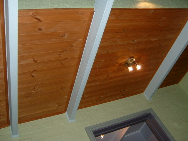 1 – Lower ceilings in living and dining rooms
 2 – Pulling back a few boards confirmed not authentic
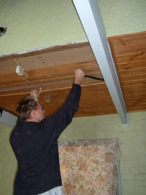 3 – So we removed the lower wood cladding
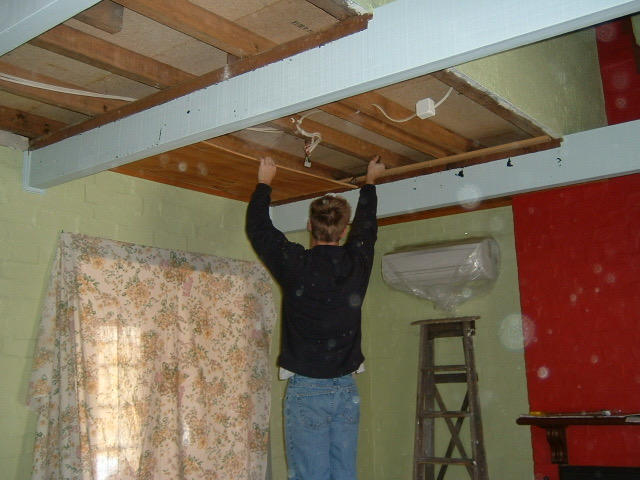 4 – So we removed the lower wood cladding
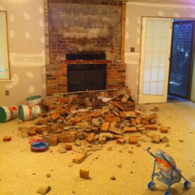
 5 – How about that fireplace color with the green walls and blue beams!?!
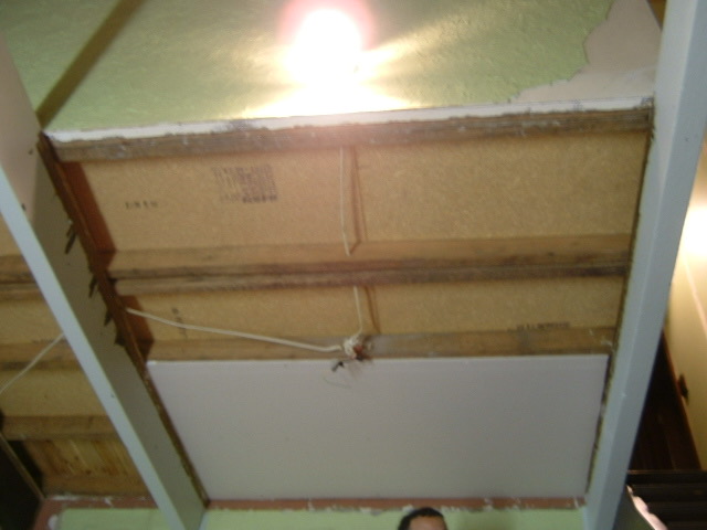 6 – Decision? Drywall: simplifying texture
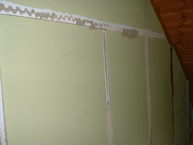 7 – No more British Barnyard
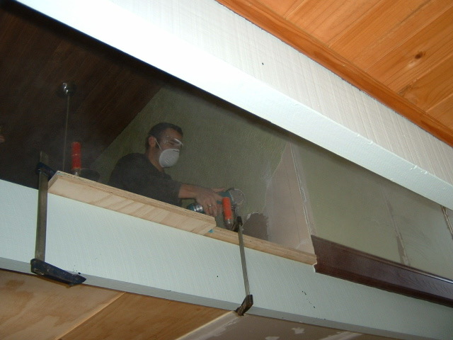 8 – All Wavy stucco removed also
From Mess to Meaning
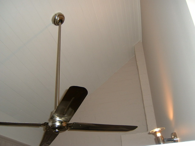
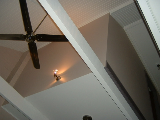
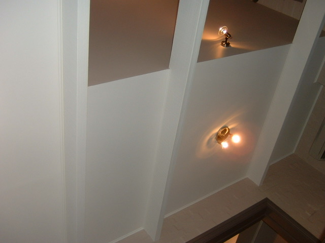
The results, I think, were compelling—despite there being no budget for excess. With renovation dollars essentially spoken for at auction, every decision had to earn its place. What emerged was a house defined by restraint and, more importantly, coherence. Walls were reduced to just two surfaces: smooth plaster or exposed brick. Mouldings were unified into a single, consistent profile throughout. Ceilings became predominantly smooth plaster, with select wood-clad ceilings intentionally preserved when they were original or they added something meaningful—like emphasizing the height of the vaulted spaces. When you can’t afford to do everything, you learn quickly what actually matters.
The color palette carried just as much weight, in part because it was one of the few powerful tools still within budget. Walls were painted a soft warm gray with a subtle violet undertone—described in the brochure as modern lavender—a hue that felt perfectly at home in Balmain’s bohemian context without tipping into anything overly trendy. Trim and doors were finished in a deeper, more saturated tone from the same color family, creating contrast while grounding the rooms. Ceilings—wood included—and exposed beams were painted a crisp white to maximize light and quiet the architecture, a small move with outsized impact.
Taken together, the house stopped shouting. Materials aligned, surfaces settled, and the original structure was given room to speak—not because everything was redone, but more because of what was undone.
A small budget turned out to be the savior. It forced constraint and simplicity, which drove the design.
Simple, Clean Look On A Strict Budget
Lessons Learned
The biggest lesson from this chapter is that tight budgets don’t have to kill good design—they can sharpen it. With renovation dollars essentially spent during purchase, there was no margin for impulse or excess, which forced every decision to earn its place. Instead of chasing big moves, we focused on simplification: reducing textures, unifying materials, and working with what we already had rather than layering more onto it.
Pausing periodically to assess before acting saved money and prevented irreversible mistakes, while repetition of a clear process—strip, stop, study, simplify—kept scope creep at bay. When you can’t afford to do everything, you learn quickly what actually matters, and that clarity can become a design advantage.
What’s Next – Chapter 6
Chapter 6 dives into the second-floor design. Originally, the floor featured four bedrooms and two full baths—a sensible layout that, over time, gave way to a series of well-intentioned but awkward changes. Most notably, two guest rooms were merged into a comedically long 26-foot bedroom, effectively turning it into a bowling alley while leaving other spaces untouched.
Our redesign restores balance. By reclaiming square footage from the oversized room and eliminating three unnecessary hallways, the second floor becomes far more efficient—making room for a proper second-floor laundry, an expanded guest bath, and two walk-in closets for the primary suite.