Buying More than Brunch
In late October several years ago, we met my sister and her husband for brunch in Downtown Crown’s main square to celebrate my birthday. Halfway between our homes, Crown’s “new urbanist” neighborhood offers walkability and a solid line up of coffee shops, wine bars, restaurants, and entertainment — plenty to linger over after brunch.
Only six miles outside the Capital Beltway, Crown wasn’t the exurbs. It was rare infill development — close in but not claustrophobic, established yet entirely new.
The neighborhood brings together luxury mid-rise condos, elevator brownstones, and single-family homes — designed for adults entering a new phase of life, when kids are grown and gone, yet without the tradeoffs that come from downsizing. Unusual for Washington’s sprawling, colonial-heavy suburbs, the development leans industrial: brick and metal façades, floor-to-ceiling glass, chain-link-suspended awnings, and front porches mercifully free of the overly theatrical Gone-with-the-Wind columns.
We had met my sister and her husband there several times before. This time, we stayed after brunch and wandered into the sales center.
“I can’t believe you can just walk into a shop and buy a house in less than thirty minutes,” Ramiro said in mild shock as we stepped out of the model home. “It takes longer to buy shoes in Argentina,” he added, looking around at the new neighborhood we would call home for the next several years.
It turns out you can — at least here in the U.S.
To be clear, it wasn’t entirely an impulse purchase. We had been house hunting for over a year — though that’s generous. We were really garage hunting. The one thing our Bethesda house didn’t offer was a garage, and adding even a detached one wasn’t allowed by the HOA. If one had been allowed, every property has a spend limit, and we were approaching ours.
We had been eyeing a specific lot where the developer was finishing a row of industrial-modern brownstones. More than once, we had said the best lot in Crown was the corner of Crown Park Avenue and Kepler Drive — a south-facing end unit with sweeping views of the main square and floor-to-ceiling windows spanning the full height of its four-story façade. We pictured ourselves on the dual rooftop decks: morning coffee on the east, sunset happy hours on the west. Front-row seats for people-watching and the live music nights Crown Park was quickly becoming known for.
It had gone under contract a few weeks earlier. We assumed the perfect property had permanently past.
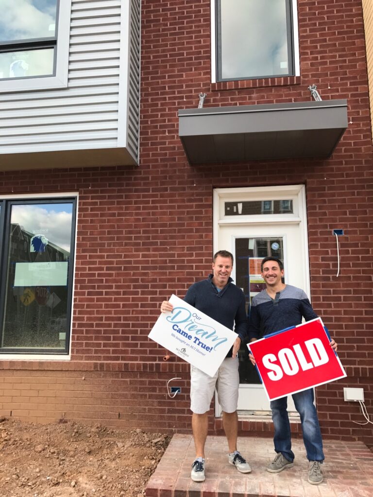
But that morning, a “For Sale” sign reappeared in the window. It was back on the market — just in time for post-brunch impulse shopping.
We made a low offer and asked for more than $90,000 in free upgrades. It was accepted.
Luckily, I had my checkbook. And just like that, for our next housing adventure, we would try something entirely different: brand-new construction.
Bought, Built, Now the Fun Begins
 New build for brunch
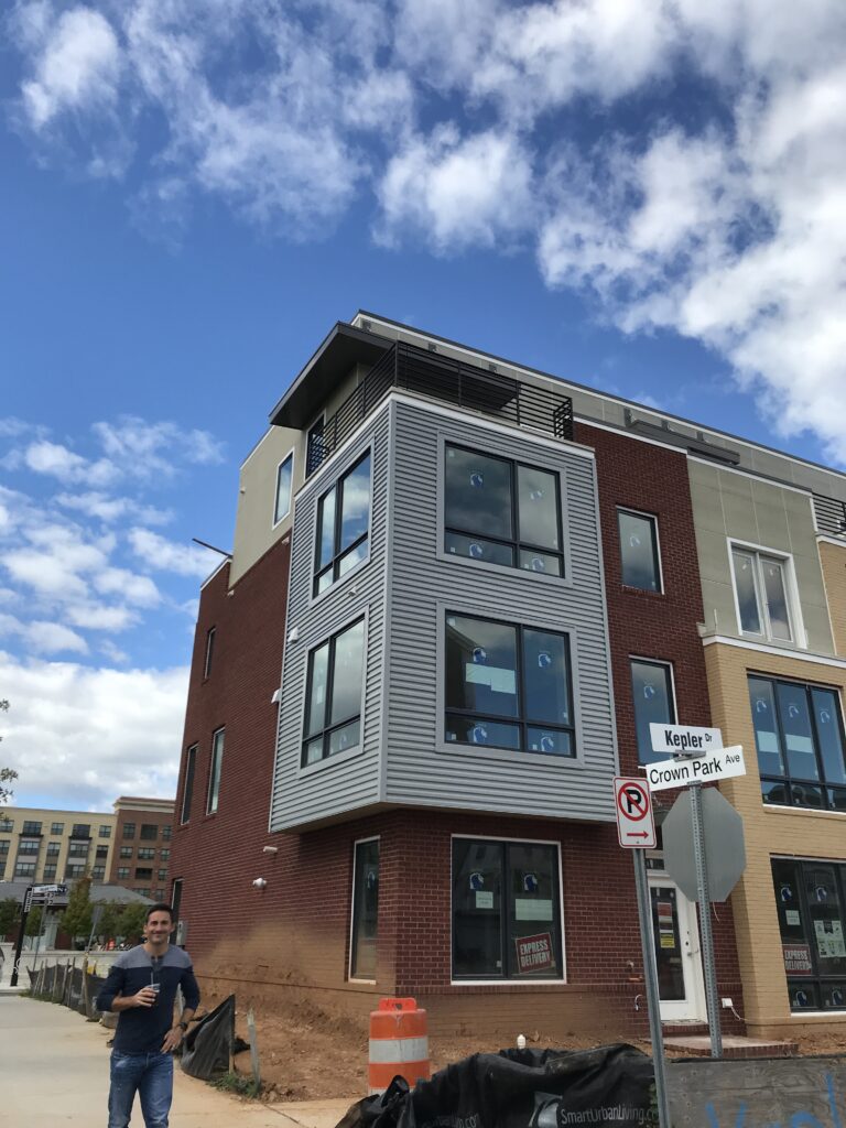 Light filled south-facing end unit with dual rooftop decks
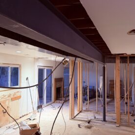
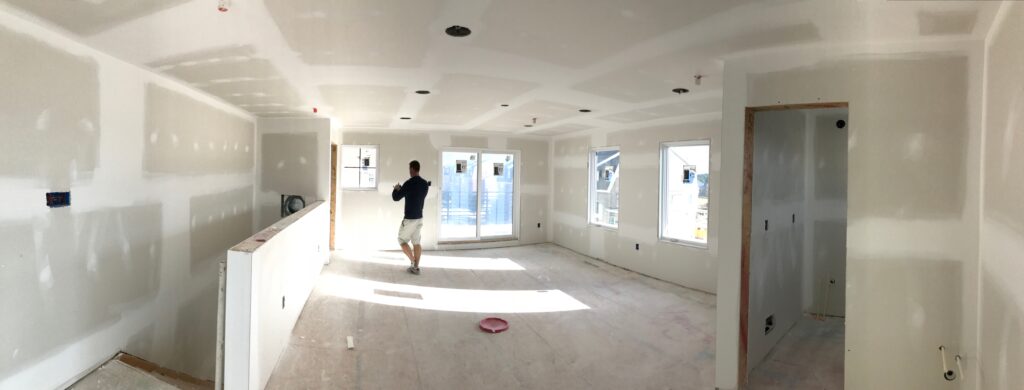 Drywall complete means no changes to rooms, electrical, HVAC, or plumbing
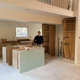
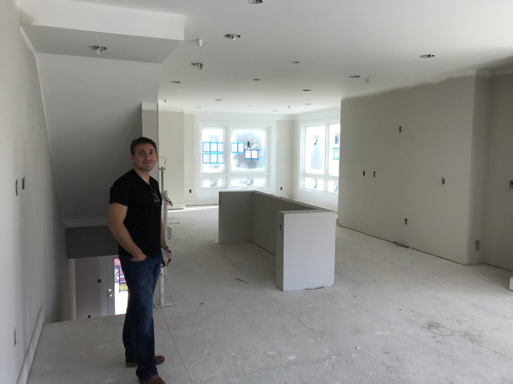 The island’s U-shape pony walls ate up square footage and potential storage
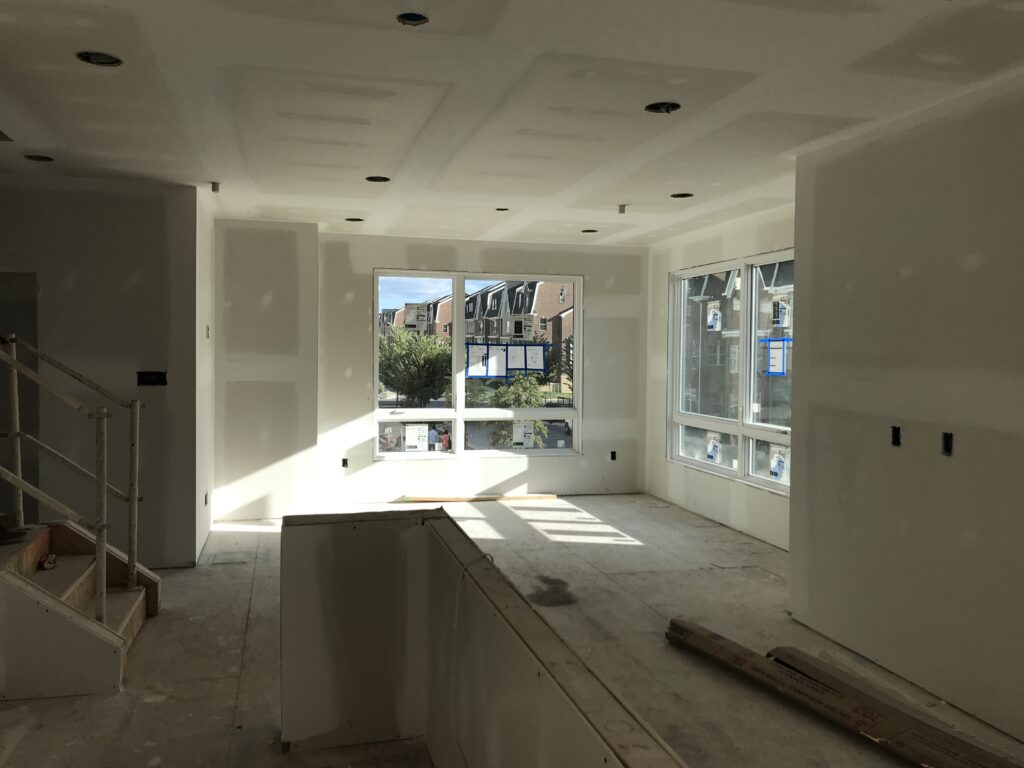 The island’s U-shape pony walls ate up square footage and potential storage
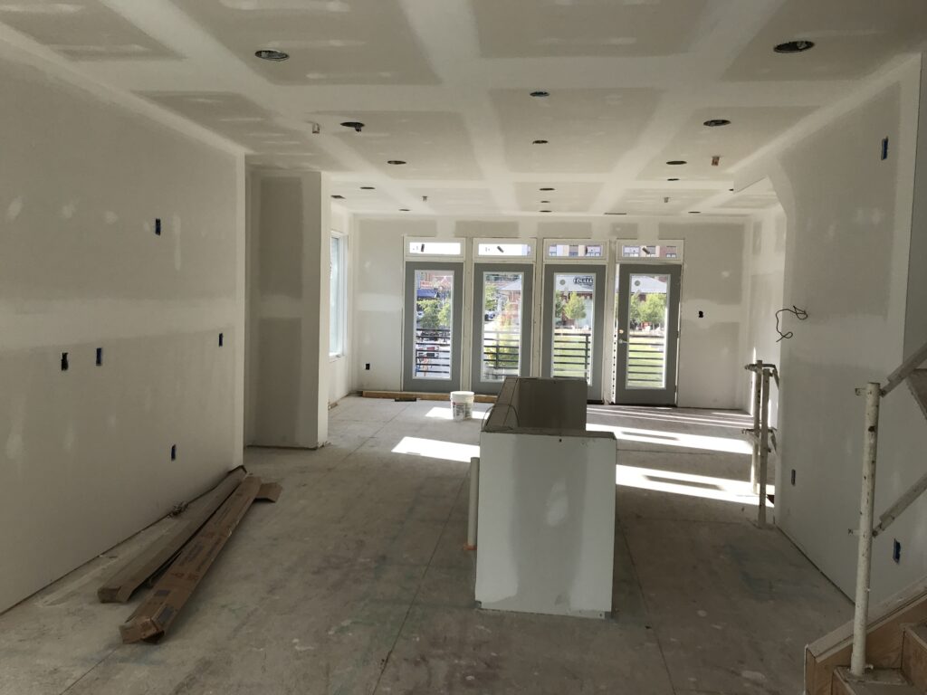 A smaller island would have enabled pantry cupboards along the stair wall (right)
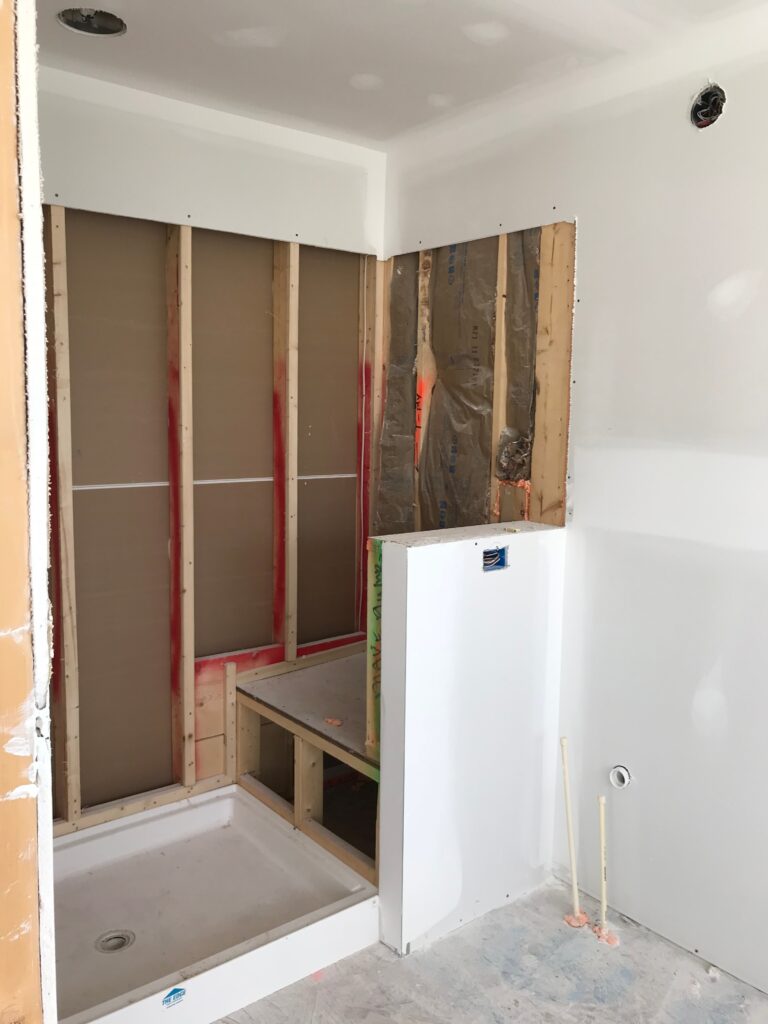 Worst offender: giant ledge in primary shower
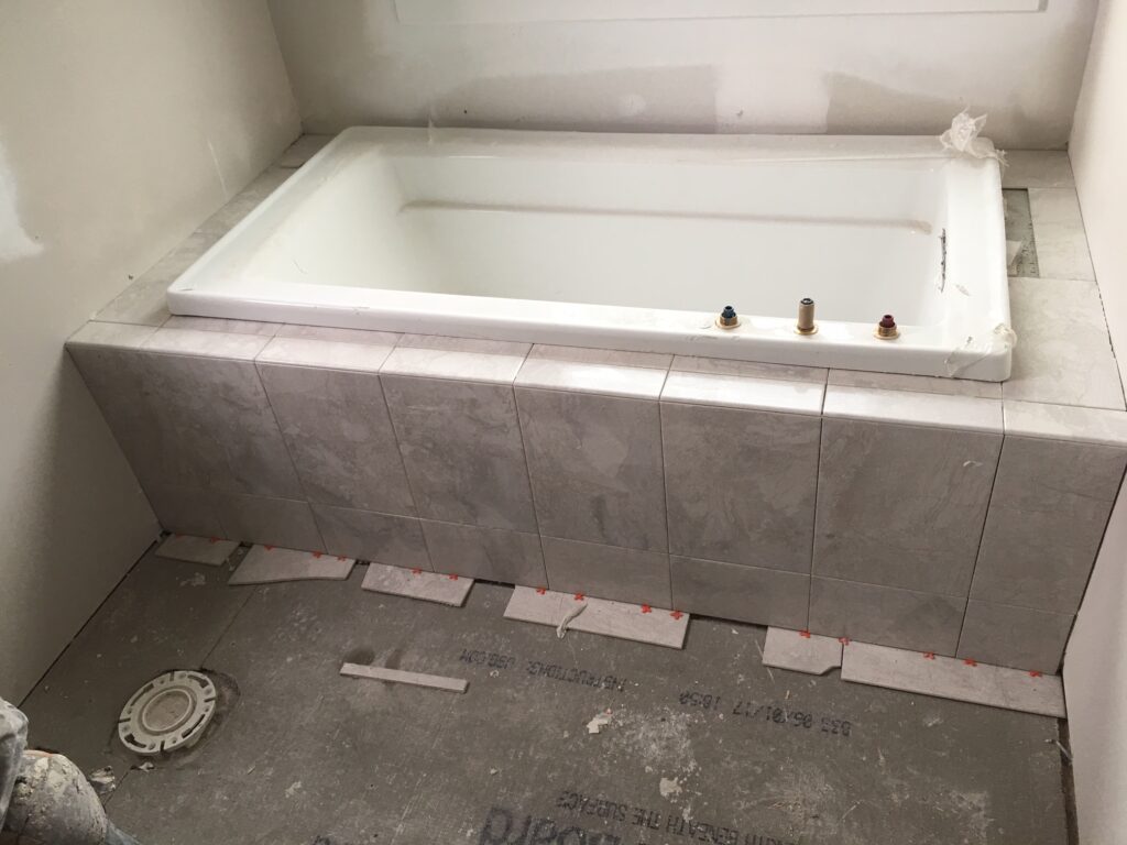 Platform tubs absorb a ton of square footage
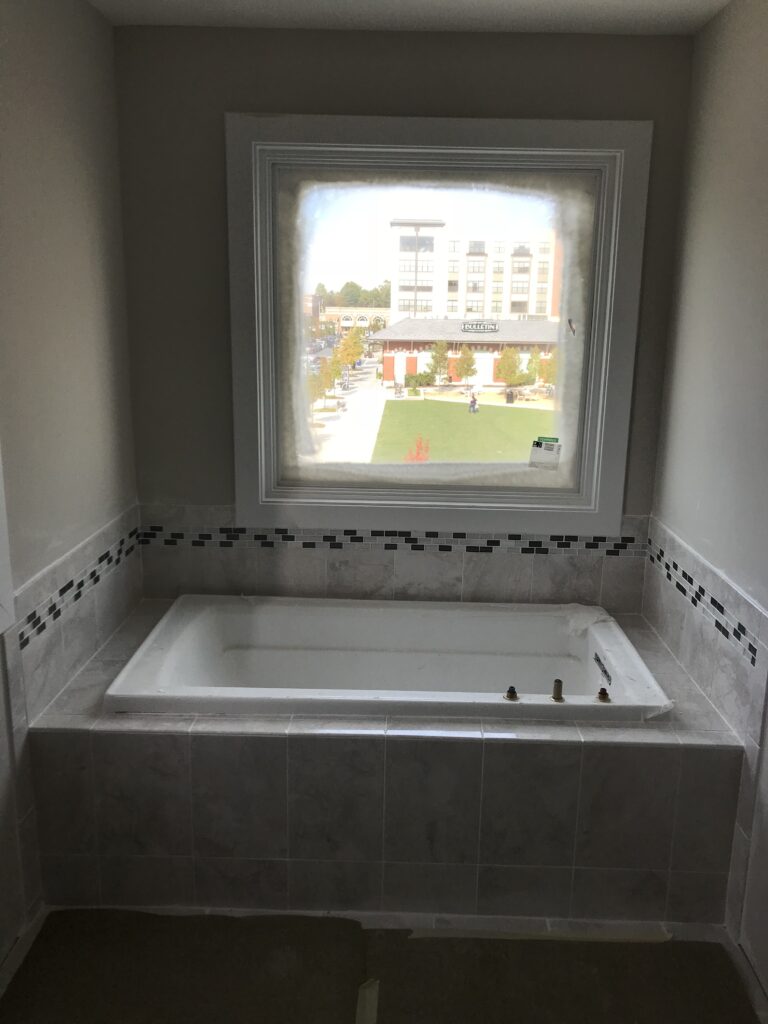 Platform tubs absorb a ton of square footage
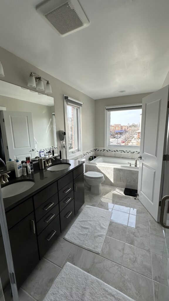 Oversized fixtures in primary bath
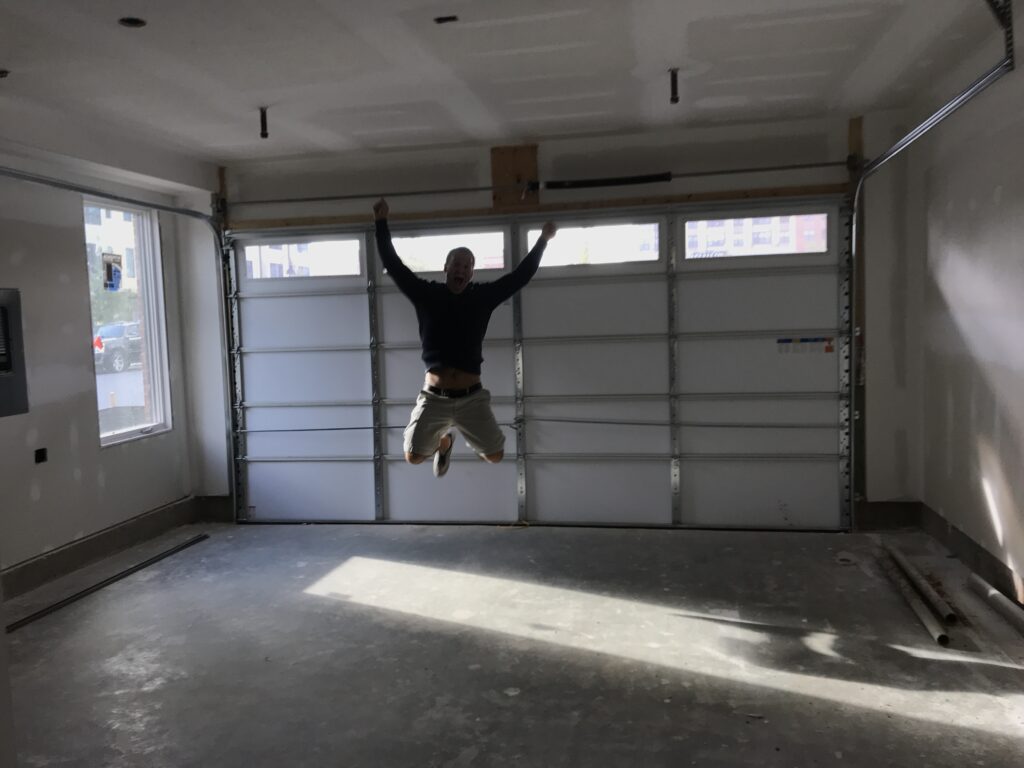 Super happy to have a 2-car garage though
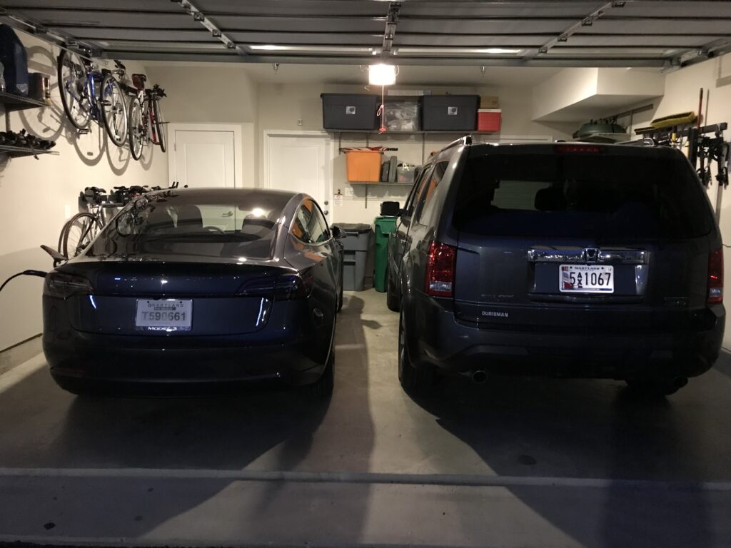 In home high speed charging “filled up” the EV for under $1
 Livingroom had the best views of Downtown Crown’s Main Square
 Rear rooftop deck and Sunset Happy Hour view of Crown’s main square
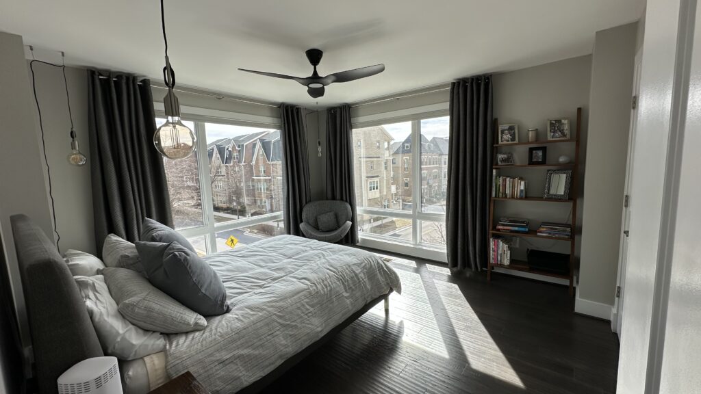 All of the bedrooms featured private ensuite bathrooms
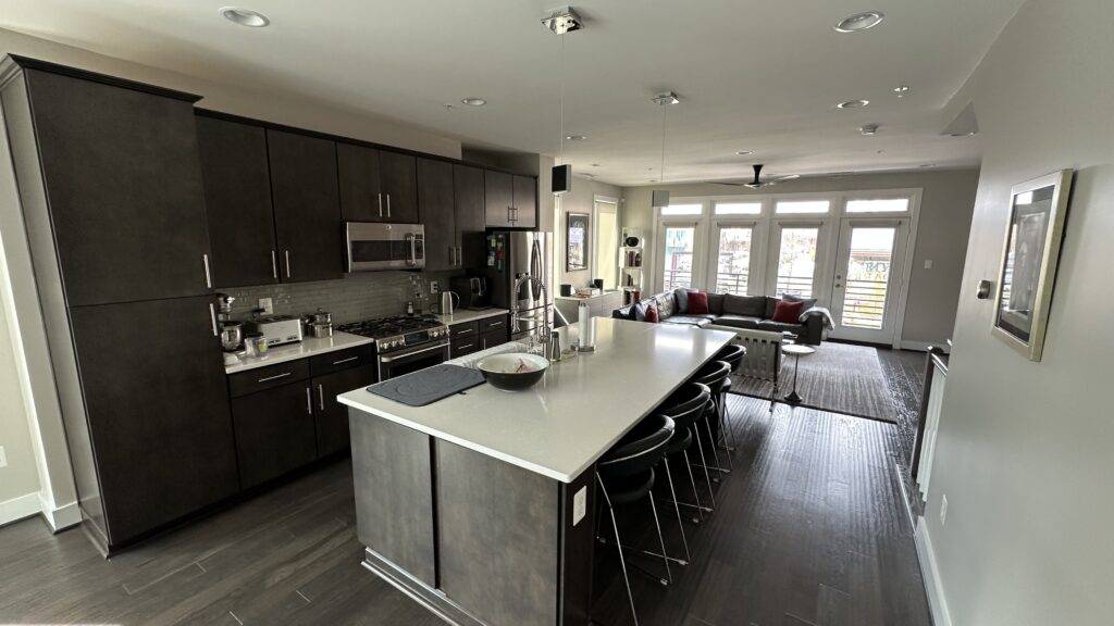 The giant island, great for entertaining, limiting on storage
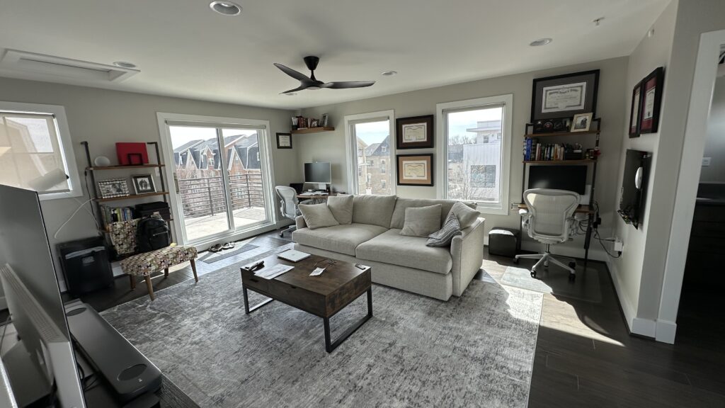 Really nice to have separation of home office, especially during the pandemic
Drywall Complete
The house was drywall complete — exactly what it sounds like: the walls were up and finished.
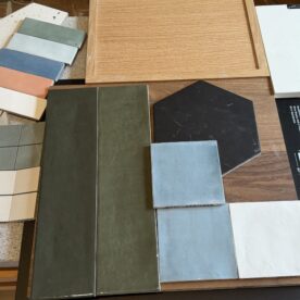
And to be fair, it was a strong start: open-plan living on the main floor, private bathrooms for every bedroom, and a large fourth-floor loft positioned between two rooftop decks. We were able to select 100% of the finishes — cabinets, hardware, flooring, tile, colors. All the visible things.
What we couldn’t change were any walls.
At drywall complete stage, plumbing, electrical, and framing are locked in. In hindsight, we should have pushed harder on a few decisions that felt minor at the time — we didn’t yet understand how expensive “minor” adjustments become once the walls are closed.
Two issues surfaced within the first year of ownership: kitchen storage and the primary bathroom layout.
The kitchen’s oversized double island made a strong first impression during walkthroughs, but over time we realized how much storage the U-shaped framing consumed. In hindsight, a standard-width island paired with floor-to-ceiling pantry cabinets along the stair wall would have better balanced presence with practicality. We also learned that we strongly prefer drawers in lower cabinets; crawling around on hands and knees to retrieve pots and pans has zero appeal. Beyond function, drawers create symmetry and provide a cleaner, linear profile. One option we considered but ultimately didn’t pursue was extending the upper cabinetry to the full 11-foot ceiling with glass-fronted, backlit cabinets — which would have emphasized the room’s height and introduced another layer of light.
The primary bath, however, was the lesson we saw coming long before contract and closing. Even in its half-built state, the platform tub and deep shower ledge signaled a missed opportunity. The room was generous in square footage but less efficient in layout. A large platform tub and an awkward three-foot shower ledge absorbed space that could have been used far more intentionally. In early walkthroughs, we seriously considered insisting on a redesign — or walking away altogether — but ultimately decided not to push for revisions, a decision that, in hindsight, became one of the most valuable lessons of the build. At framing stage, changes are inexpensive. After drywall, reshaping space rarely is.
Final Walkthrough, First Chapter
The Studs Don’t Add Up
Four years into the house we priced out revisions to the kitchen and primary bath, the numbers confirmed it. The cost to correct them exceeded what the market would reward in resale value. The issues weren’t showstoppers by any means, but they were economically irrational to fix in a brand-new house.
So we left those spaces alone and instead focused on what we could profitably and carefully curate. We leaned into the houses’ unique aesthetic, layering texture to elevate areas that felt flat, reinforcing the industrial modern design language, and banishing the builder grade.
We Don’t Need No Renovation (just another brick in the wall)
What’s With You and Bricks?
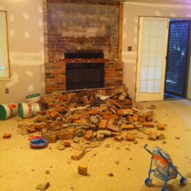
“What’s with you and bricks?” my friend Tim asked after seeing a video of me jackhammering a brick hearth out of our current mid-century restoration. “I know hundreds of people and none of them have ever had a project with bricks. Then there’s you — one person — who’s had four houses now with massive brick work. Were you a bricklayer in a former life?”
Fair question.
Bethesda. The beach house in Florida. Downtown Crown. Bethesda again. At some point it stops being coincidence.
In Crown, though, we weren’t tearing brick out. We were layering it in.
The front entry lacked drama, and the main staircase leading from it to the primary living spaces was heavily trafficked. The wall quickly became a casualty zone — grocery bags, gym bags, rolling suitcases. Painted drywall simply wasn’t built for that kind of daily impact. Reflecting on my Capitol Hill house, which featured a brick wall along the staircase, gave us inspiration.
Exposed brick. Well, sort of.
In older homes, like those in Capitol Hill, uncovering decades of plaster reveals century-old masonry. The result is a beautiful, exposed brick wall. In modern construction, however, opening a wall doesn’t reveal character. It reveals insulation and a cement firewall. Not exactly romantic.
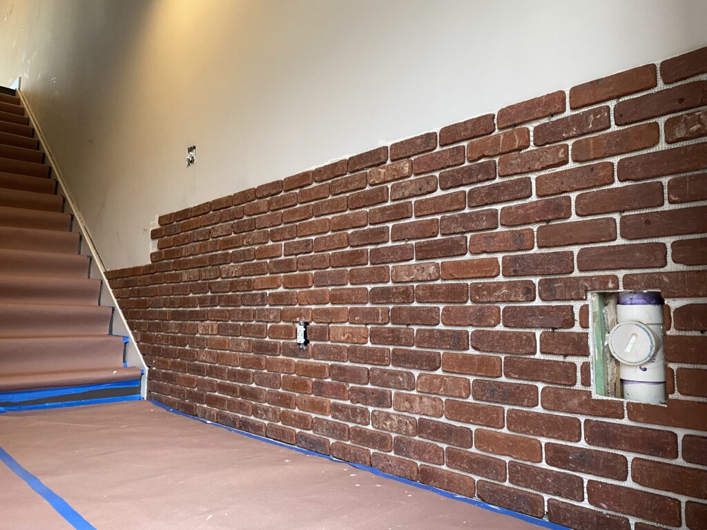
So instead of revealing brick that wasn’t there, we had to source some.
A salvage company in Boston specialized in reclaiming bricks from old industrial buildings, slicing them in half, and repackaging them as veneer so both faces could live again as architectural surface. It was industrial history, redistributed.
We installed an “exposed brick” wall beginning at the entry, running up and along the main staircase, continuing through the living room, and stretching all the way to the back of the house — forty-three linear feet in total, with ceiling heights ranging from eleven to fifteen feet.
Needless to say, it changed more than the look of the house. It transformed the entry into something layered, dramatic, and reinforced the industrial-modern language of the house, aligning the interior with the exterior. Sometimes the right design choice is also one that improves functionality that withstands daily life, or at least your gym bags.
The Great Wall of Crown
 Starting in the entryway
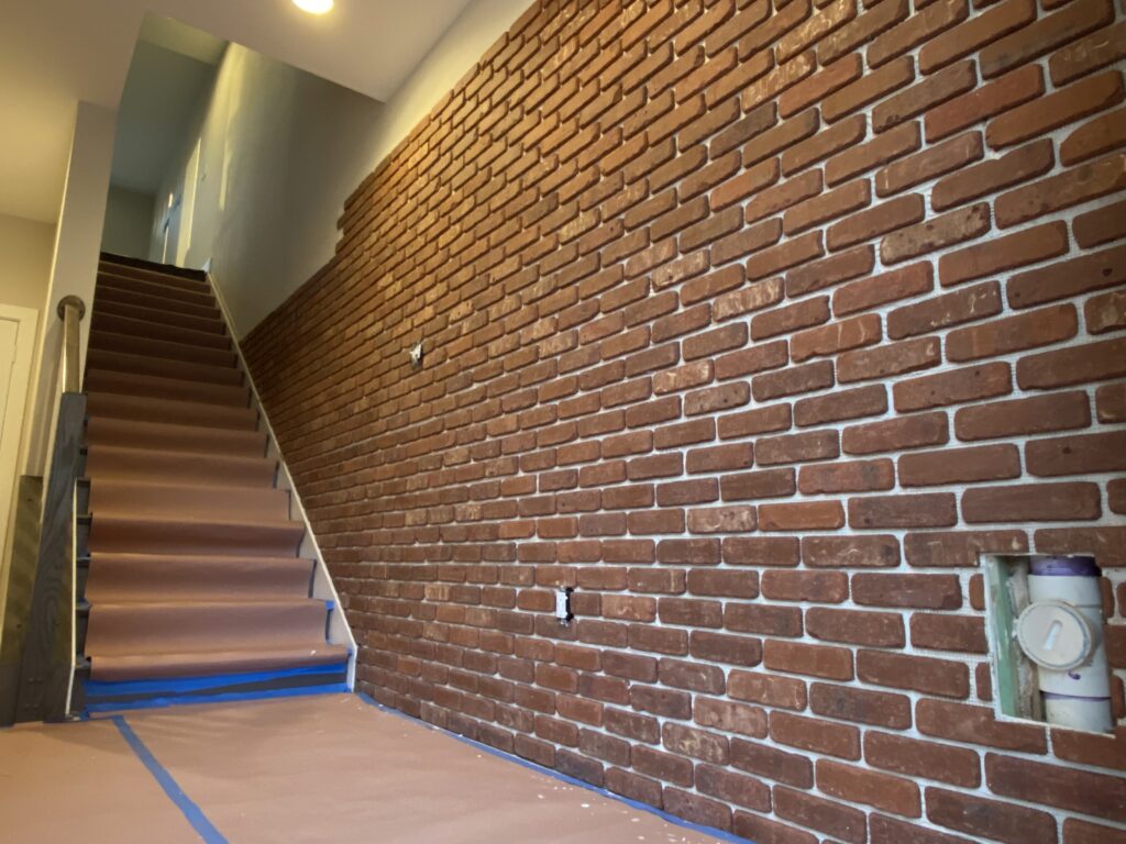 The brick carried up the main staircase
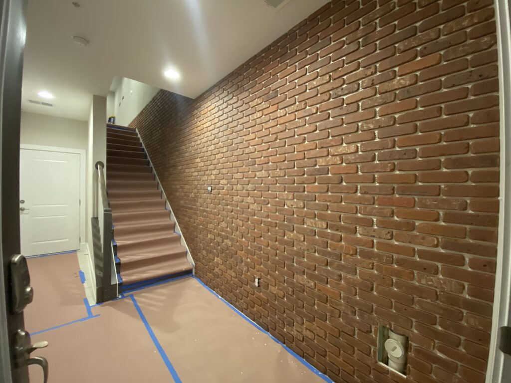 The brick carried up the main staircase
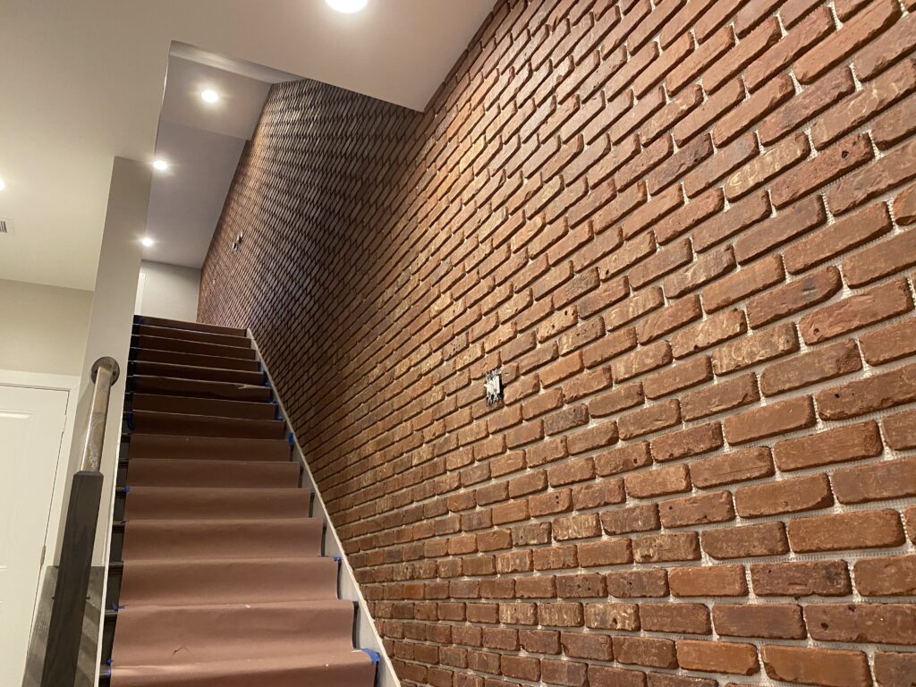 And eventually through the living room
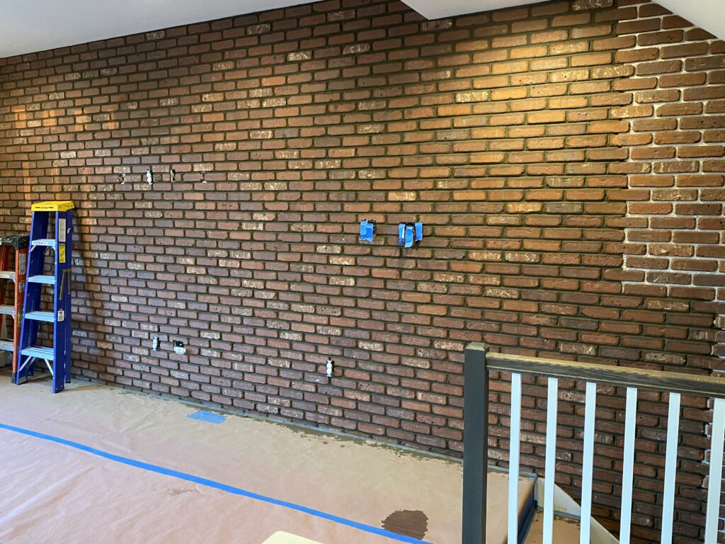 Finally reached the top
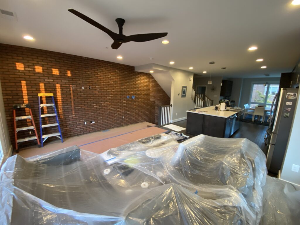 The look added texture and felt true to the industrial exterior
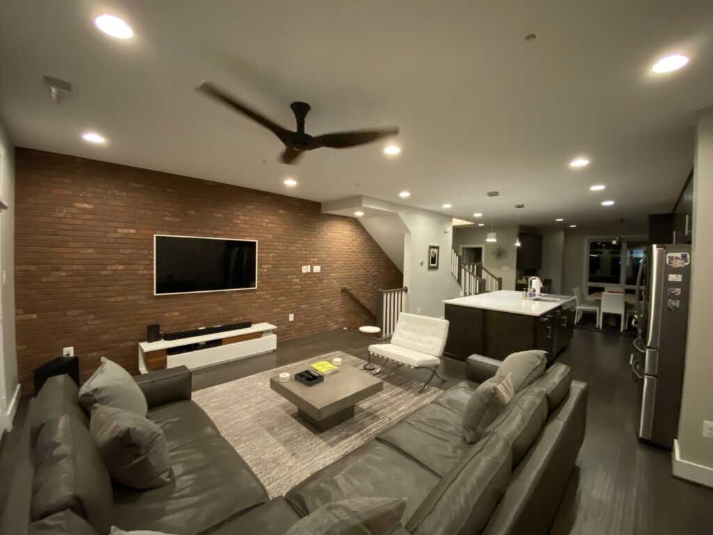 Dramatic finish
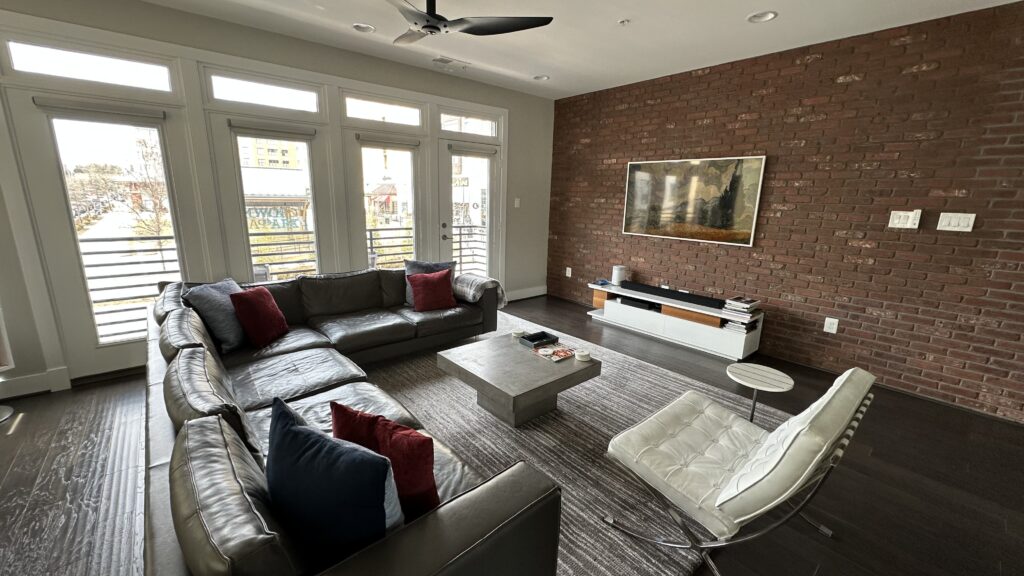 Dramatic finish
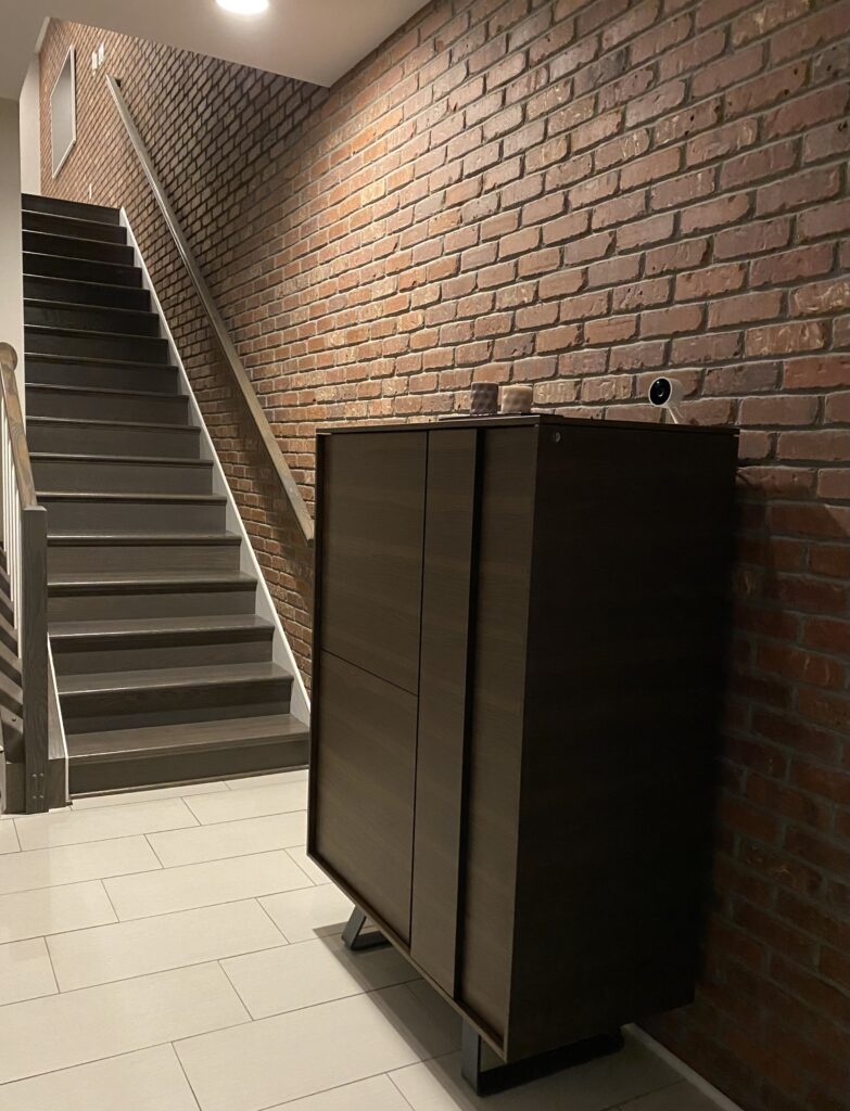 Much warmer and inviting entryway
Credenza & Cabernet
Rather than reworking the brand-new kitchen layout, we looked elsewhere to add the storage we needed for all of our entertaining gear.
We didn’t have to look far.
The adjacent dining room felt oversized, even with an eight-person table anchoring it. Two floor-to-ceiling windows perfectly framed the table, and if the room had squared cleanly around them, the proportions would have felt balanced. Instead, a five-foot-wide, three-foot-deep alcove along the left interior wall subtly pulled the room off center. With the table aligned to the windows, the negative space made everything feel slightly off. So we decided to put the space to work.
Inspiration here came from our neighbors, Carol and Greg, who had added a run of cabinetry along the same wall — essentially a built-in serving bar and credenza all-in-one. Their solution made immediate sense. Experiencing how seamlessly their change expanded both form and function through many dinner parties convinced us to think beyond the builder grade and elevate our space with structure, storage, and style.
So Ramiro and I borrowed — fine, stole — the concept and adapted it to our needs. Instead of a serving bar, we created a wine bar: a French-door double wine refrigerator, flanked by base cabinets, topped with a contrasting countertop for pouring wine and staging side dishes. Upper cabinetry provided storage for glassware, relieving pressure from the kitchen. It wasn’t a correction of the kitchen layout so much as a redistribution of function — one that made the entire dining room feel more aligned with how we host family and friends.
The Wine Wall
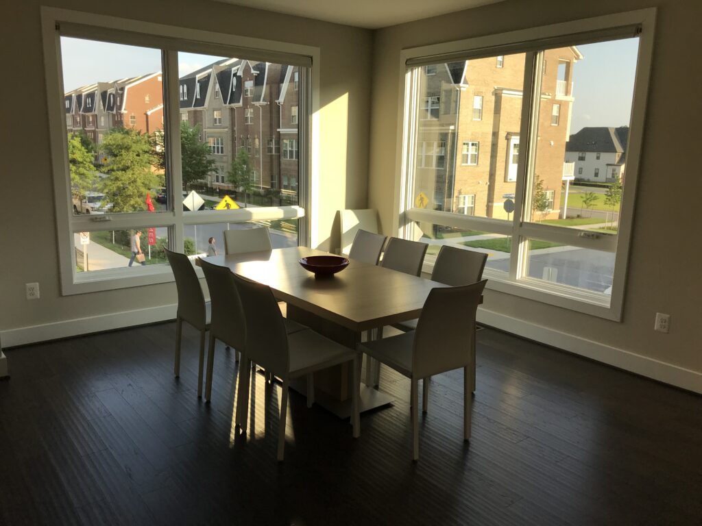 Dining room felt empty, off center
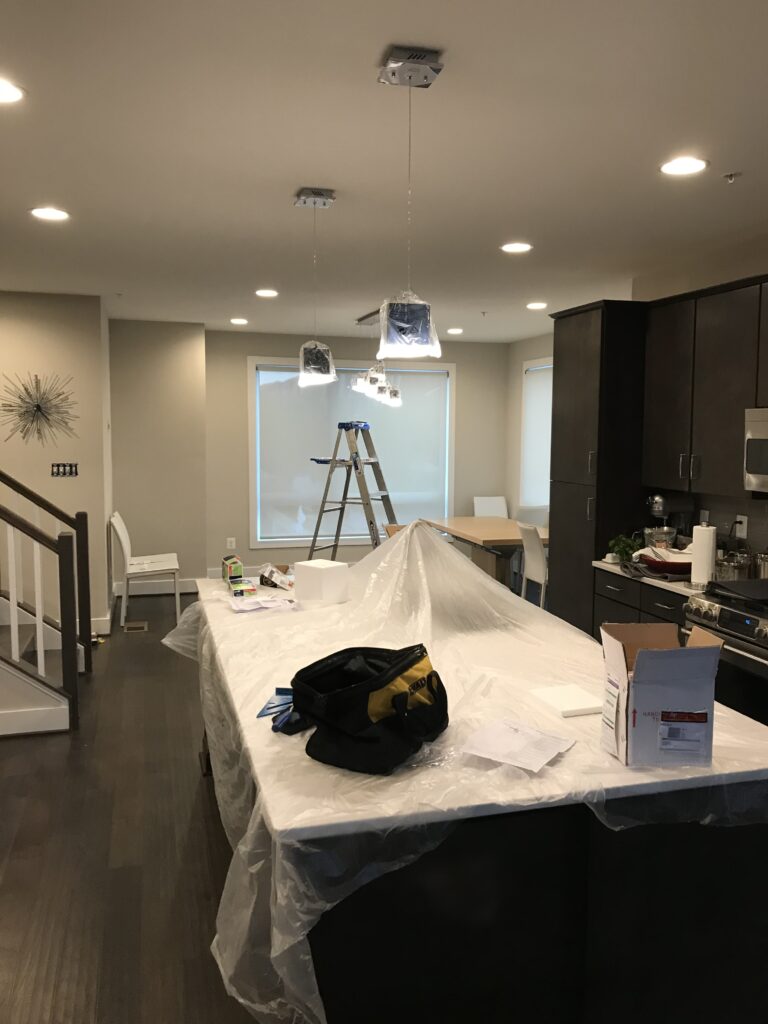 The table “centered” in the windows, not the room
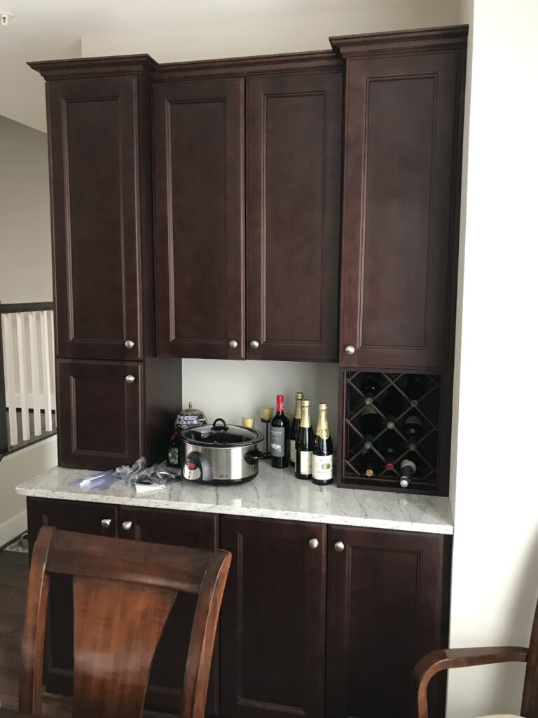 Design inspiration: our neighbor’s built in credenza
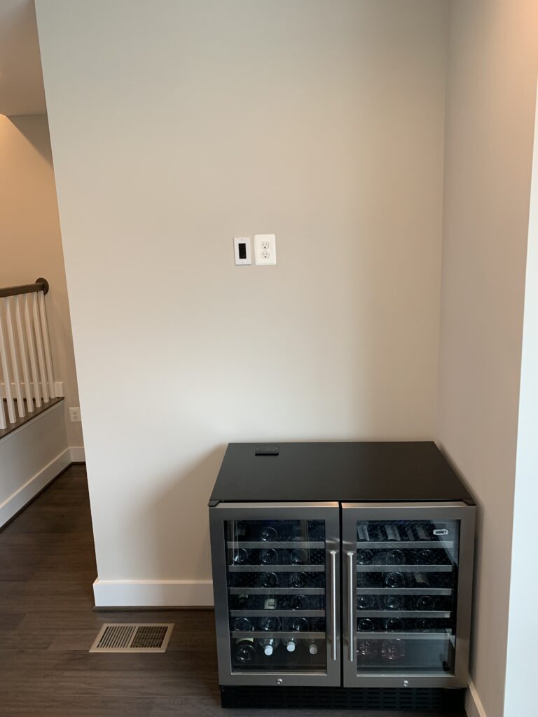 First step: buy the wine fridge
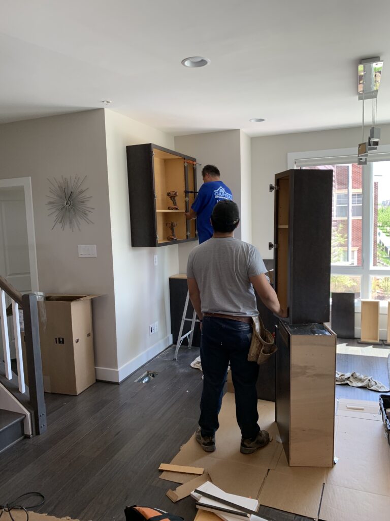 Second step: design and install cabinetry
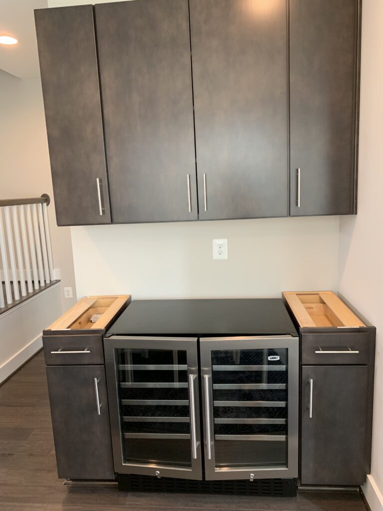 Second step: design and install cabinetry
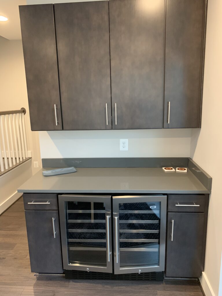 Third step: install countertop
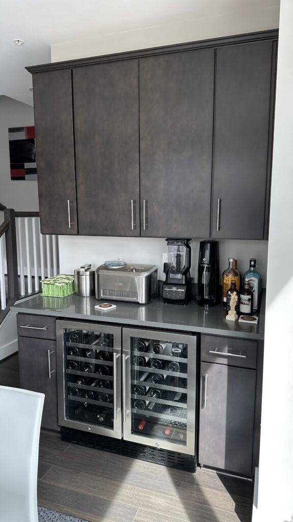 Decorate and enjoy!
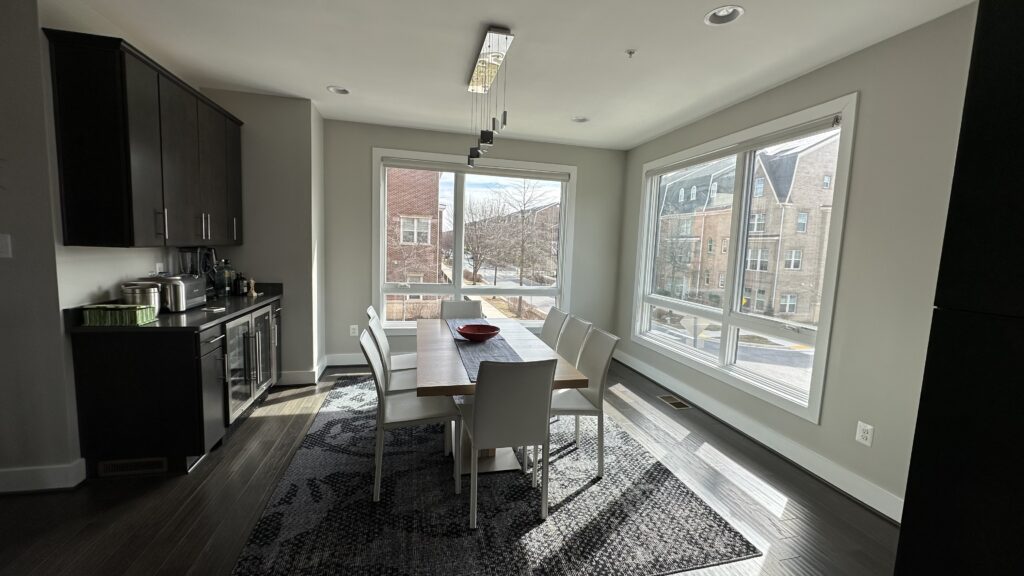 Result: the dining room felt more centered: structure, storage, and style added!
Power Room Perfected
The powder room was the easiest place to make a statement without breaking the bank. Small spaces allow for bolder material choices because small square footage keeps costs contained. If you’re going to splurge anywhere, do it where the footprint is modest and the impact is outsized. We removed the builder-grade pedestal sink, generic mirror, and forgettable lighting and replaced them with pieces that carried architectural weight. A floating vanity, handcrafted in Spain, introduced clean lines and concealed storage for essentials. A matte black mirror and matching floating shelf sharpened the contrast, while a sculptural LED fixture in a subtle spiral form added modern edge without overwhelming the room.
Texture did the rest. Three walls were wrapped floor-to-ceiling in large-format tile, creating depth and quiet drama, while the fourth wall introduced industrial-modern wallpaper. The dark wallpaper accent wall pulls your eye upward and plays against the hardness of the adjacent stone tile, giving the small room a layered, almost gallery-like quality. What had been a predictable powder room became a dramatic design declaration — proof that strategic upgrades can deliver disproportionate impact.
Small Space, Big Impact
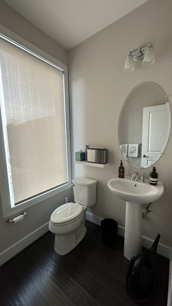 Starting point: predictable, builder-grade powder room
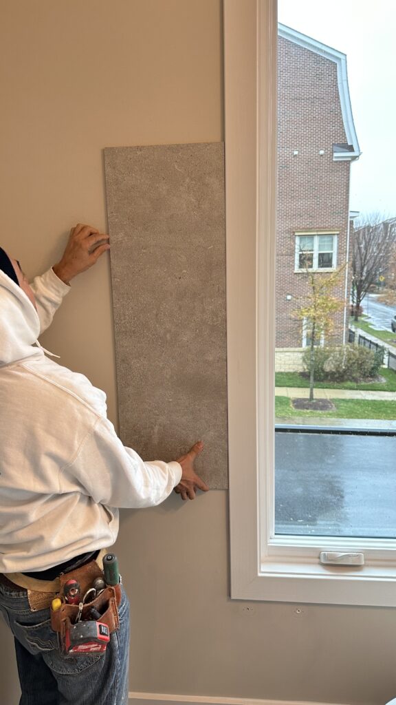 Where to start
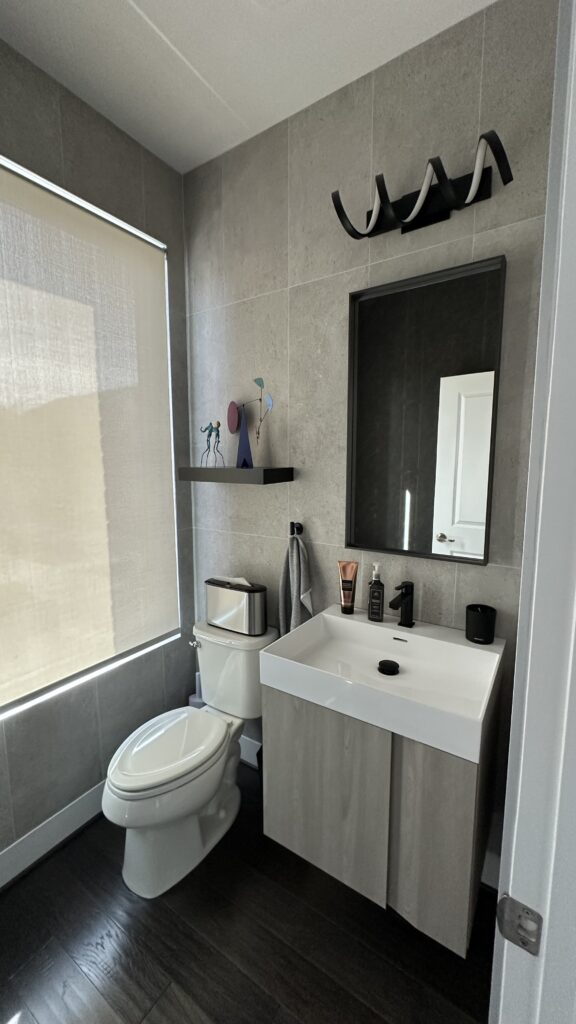 Floating vanity, matching accessories
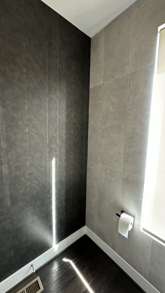 First-ever wallpaper
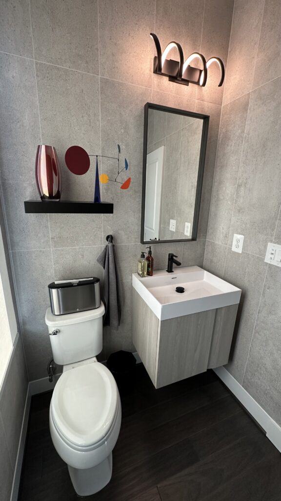 Floating vanity, matching accessories
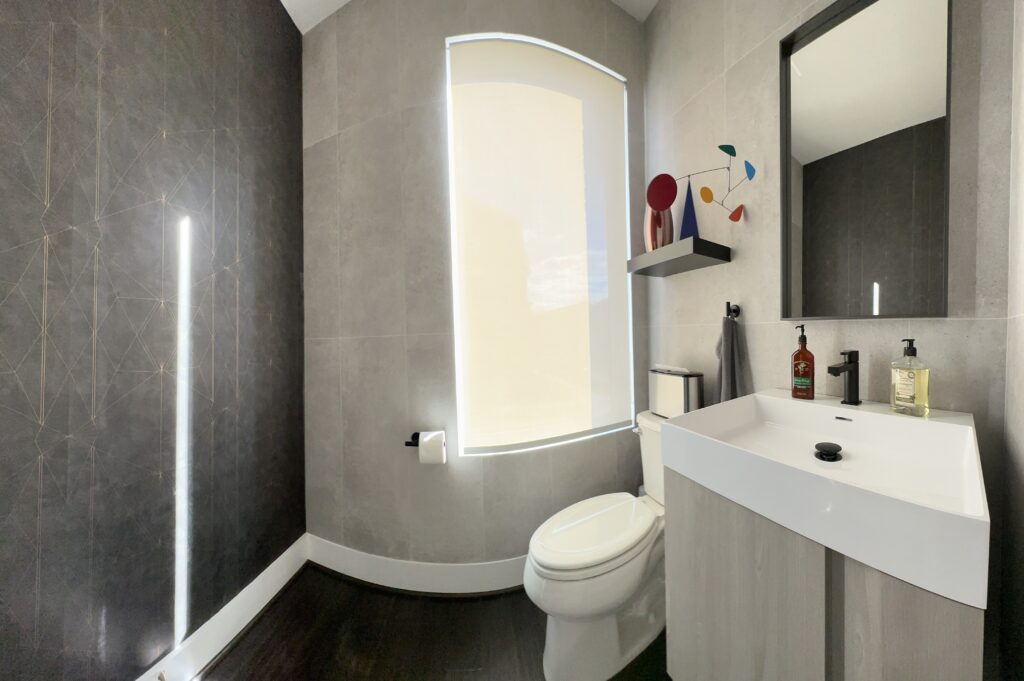 Small space, big impact!
Purposeful Pandemic Pivot
Around the same time we were bricking the staircase, we were also reconsidering the first-floor suite. It had been setup as a bedroom, but we didn’t host often enough to justify dedicating prime square footage to occasional use.
Then the pandemic hit.
Gyms closed overnight. As avid triathletes, “pause training” wasn’t an option. We improvised at first in the fourth-floor loft, but that quickly blurred the boundary between work and workouts. Living, working, and sweating in the same space wasn’t sustainable.
The first-floor suite, however, was perfectly positioned — close to the entry for quick cooldown routines after bike rides and runs, and private ensuite for cold showers. Converting it into a dedicated yoga and HIIT studio would make the space far more useable every day.
It also became the first project Ramiro and I tackled completely on our own. At the height of the pandemic, contractors weren’t available, so we committed to doing it start to finish ourselves. We sold the bedroom furniture and once again leaned into texture over color, installing an industrial-style reclaimed wood feature wall.
Before mounting a single board, we painted the entire wall black — a trick we never would have considered but learned from YouTube. Slight gaps between boards would show as mistakes if the wall were left white. Black paint shows as shadows, giving the installation depth and precision. Two coats of black paint, careful alignment, and a floating shelf later, the room transformed.
From Guest Suite to Training Grit
 It started as a perfectly nice guest room, however
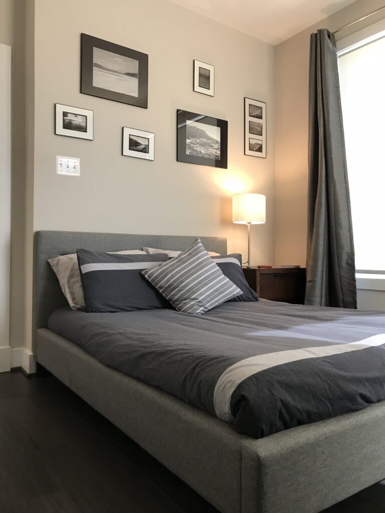 …we needed space to train
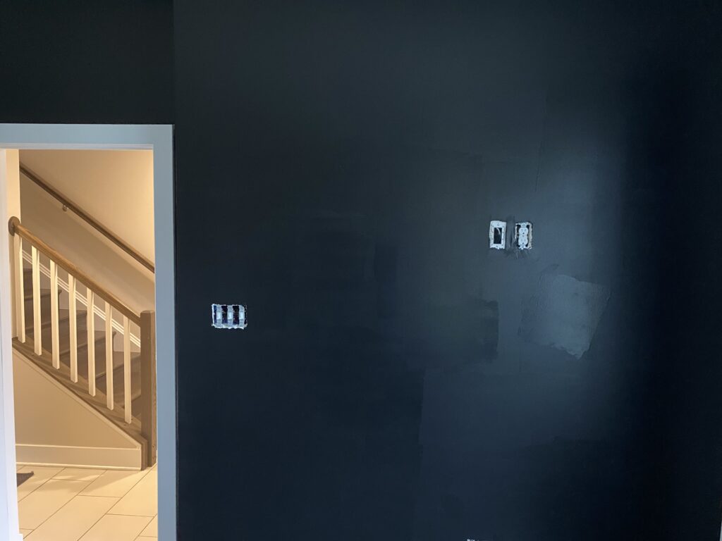 Painting the wall black hides any gaps in boards
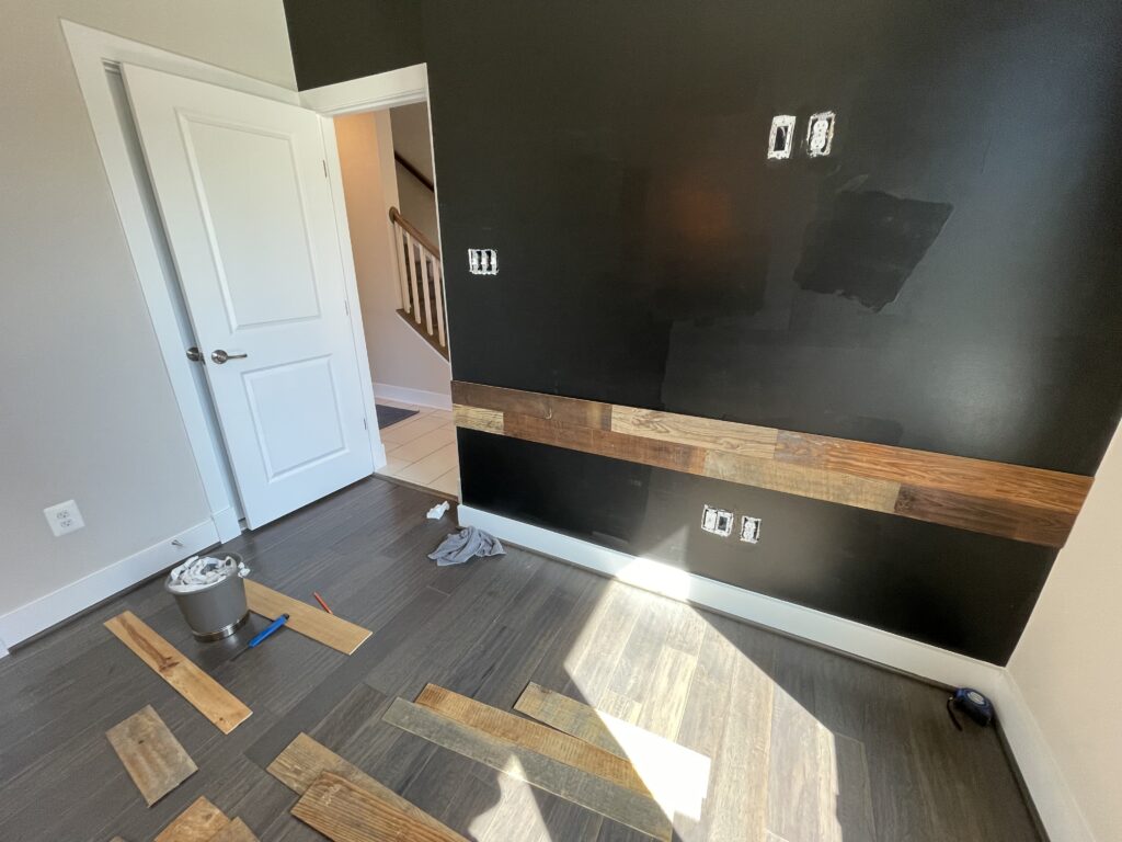 We started in the middle, then worked our way up and down covering with reclaimed wood
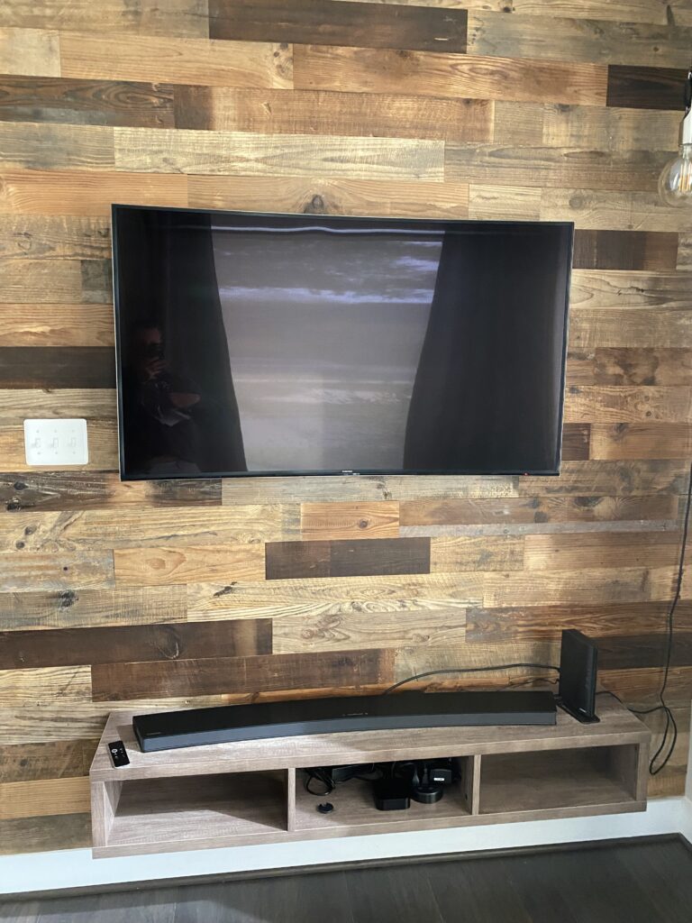 Finished the space with a TV tuned to Man Flow Yoga
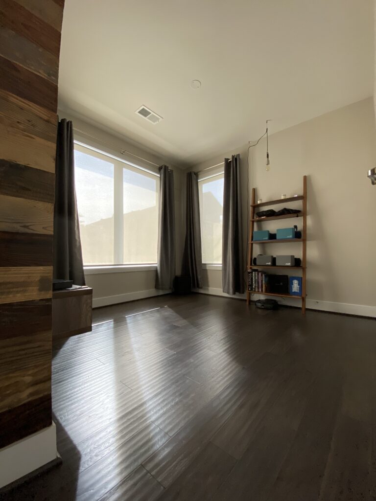 The result: plenty of space to train!
What’s next – Chapter 13
Crown was formative. It taught us that layout matters and drywall is a deadline. It taught us that when something feels off at framing, it probably is. Most importantly, it taught us to slow down — to live through rooms mentally before finalizing them physically.
Significant progress is underway at the mid-century restoration. Tile is done, paint is nearing completion. The kitchen and bathroom fixtures are going in. And this time around, we insisted where we once hesitated. We pushed where we once paused. Crown taught us how to refine. The mid-century is teaching us how to reimagine and restore — and this time, to be deliberate about every square inch.