Before We Begin
This post wraps up the Restore & Reimagine series. Well, for now. You know the gays: once everything is finally perfect, it is time to move on and do it all over again. Not anytime soon for us, though. Our sixth house was a gigantic endeavor, a long and hard-fought process we’ll remember for a long time. Although my experience with renovation is like what I’m told about childbirth: eventually you forget enough of the pain to do it again. So I’d never rule anything out.
Looking back, buying a historic house and gutting it down to the studs was a total baller move. There was definitely no undo button. After months of structural work, mechanical upgrades, insulation, drywall, tile, cabinetry, and an endless stream of decisions about every tiny detail, we finally reached the part where we could stop imagining how the house might work and actually live in it. A few months later, that has become the real test: does the house work the way we imagined, designed, and built it to?
So far, it does. In fact, it works even better than we expected, which is deeply satisfying and, if I’m being honest, slightly boring. Apparently the only thing more dangerous than an unfinished renovation is life with no to-do list. That’s usually when one of us starts looking for the next project.
Refinement and Real Life
After putting so much thought into restoring the interior with finishes appropriate to the house’s mid-century architecture, we did not want to undo all of that by dropping in furniture that fought the space. It helped that the buyer of our Crown House purchased much of the furniture we had chosen specifically for its industrial-modern style. That gave us a few blank canvases in the living room, dining room, and bedrooms. And more importantly, it spared us from trying to force the wrong aesthetic into this house.
So we went back to Chapter 2’s Design with Intention principles that had so far successfully guided the entire renovation. Stay true to the period: invite nature in, favor simple clean lines, and balance form and function. But no time capsule. A key principle was to modernize with materials and finishes that Frank Lloyd Wright or Eero Saarinen would use if they were building today. Revisiting our inspiration board helped shape what came next. Natural materials, colors pulled from the gardens outside, and furniture designed around conversation rather than screens.
And it turns out buying new furniture is way easier than moving. It is also considerably more fun. Who knew? Well, in my case, more fun than pointing while other people do the heavy lifting.
Sightlines and Spotify Age
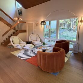
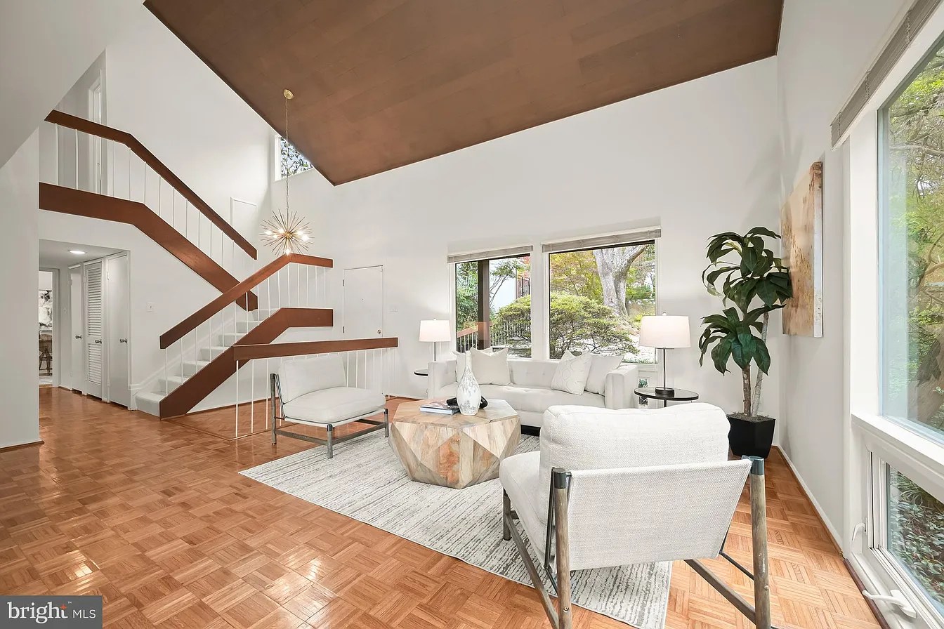
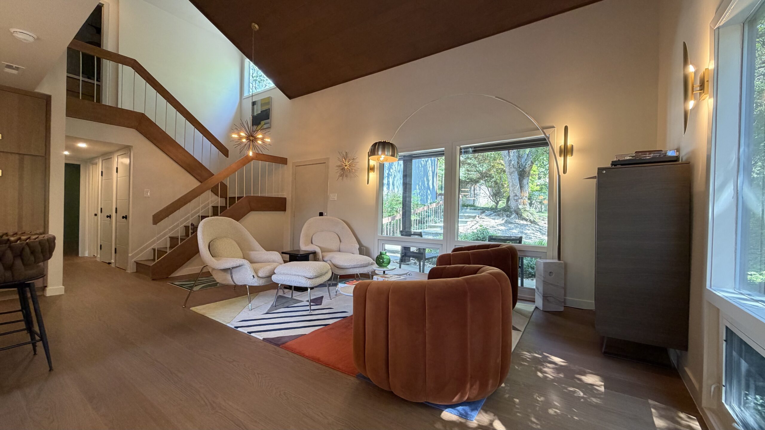
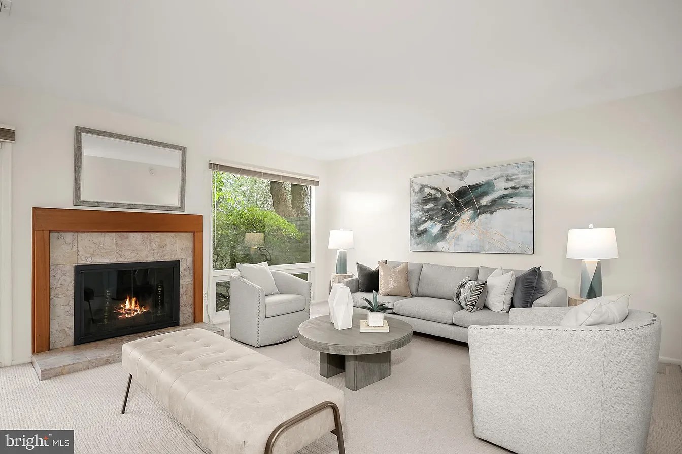
The living room was the first blank canvas to fill, and it brought us back to one of the debates Ramiro and I had before we even bought the house: what would we do with a formal living room we would never use? Then we came across one of the hallmarks of the era: the conversation pit. We realized the room could become a modern interpretation of that idea, minus the Roomba-hostile hole in the floor. Less formal living room, more informal gathering place designed to receive guests and encourage actual conversation.
So we set out to build a hole-less conversation pit. The first decision was no sofa. We did not want to block sightlines through either of the two floor-to-ceiling windows into the private gardens, and for the same reason we skipped curtains entirely. The house was designed around framed views into a brick-walled landscape, and after living here a few months, we confirmed what we suspected: privacy was already built into the lot.
The first piece we landed on was a Jonathan Adler coffee table with an Art Deco-inspired base and five round terrazzo tops. It felt period appropriate without slipping into nostalgia. A modern credenza we had bought for the Crown house survived the furniture purge and fit perfectly between the two large windows, where it now serves as a bar. With those contemporary anchors in place, we pulled the seating more firmly toward mid-century: two Rove Concepts Womb chairs in almond bouclé opposite two tufted velvet swivel chairs from Crate & Barrel, all tied together by a geometric Safavieh rug. An I-beam side table adds a subtle wink to the massive steel beam overhead that made the room’s connection to the kitchen possible. A Castiglioni Arc lamp finishes it off, delivering ambient light without interrupting the openness we worked so hard to create.
And finally, there is the turntable, paired with a leather-bound Marshall speaker. There is something wonderfully theatrical about standing up, walking across the room, noisily selecting a record, and flipping a thick brass toggle switch to start the music. Even better is when guests get involved, digging through a collection that now runs from Neil Diamond to Sombr.
Also, it gives me the ability to enjoy classic music without destroying my Spotify age!
Before and Now – Living Room
Minimalism, Marble, & Midnight Guests
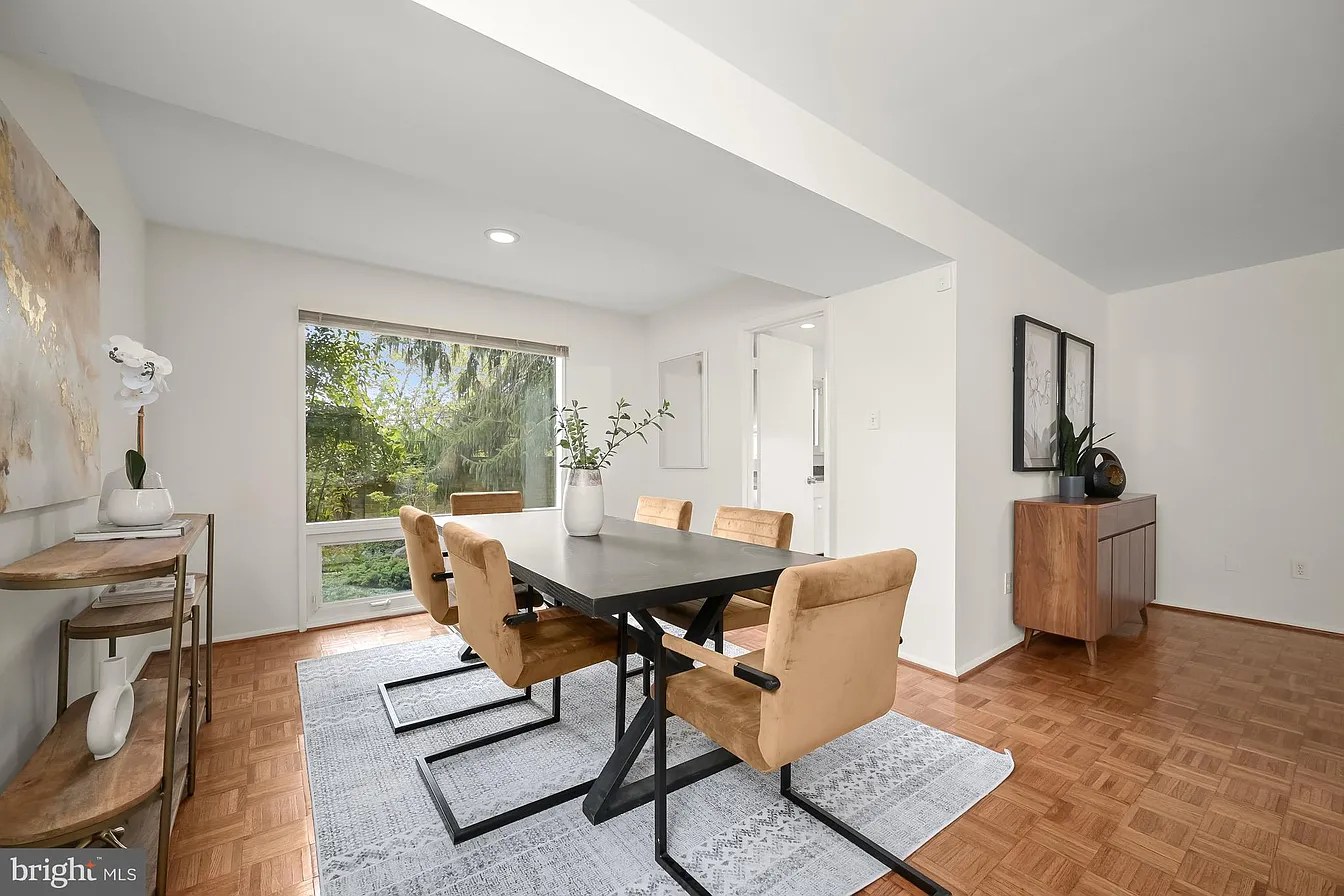
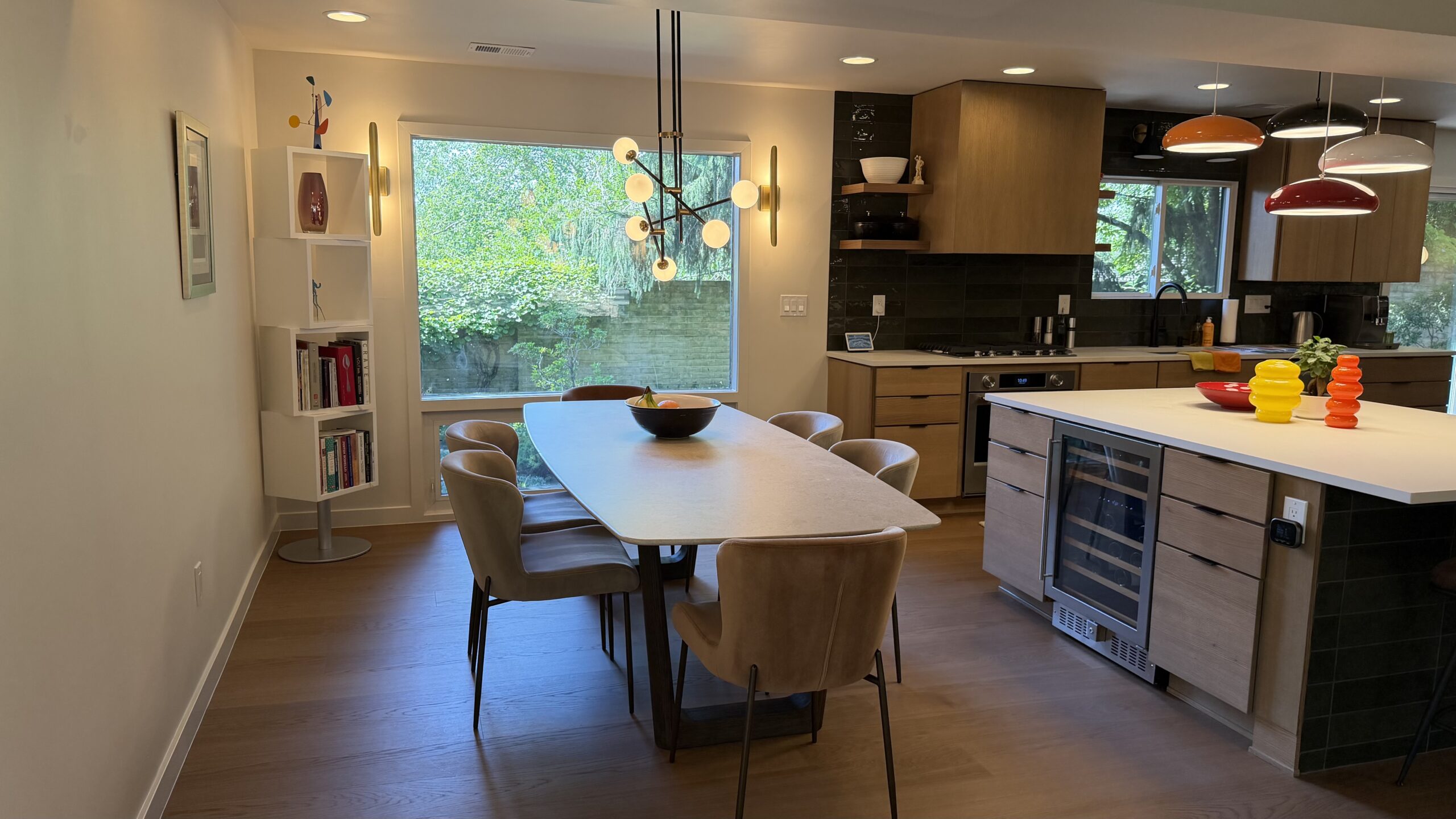
The next blank canvas was the dining room. Here, we wanted restraint. The newly opened floor plan, the south-facing light, and the backsplash tile, chosen to echo the magnolia trees in the Japanese garden, already gave the room plenty of purpose. I would have LOVED Saarinen Tulip chairs from Knoll but at $5,000 each they were not in the budget. As I learned in Sydney, constraints have a way of encouraging creative minimalism.
Instead, we borrowed an idea from a neighbor and worked with a very patient sales rep at Arhaus to build a customizable dining set that would not overtake the room. The first choice was a 96” marble top, selected to feel like an extension of the kitchen island. An open base lets sunlight from the floor-to-ceiling window filter through. Crushed-velvet side chairs in almond pick up the Womb chairs in the living room, while cognac captain’s chairs read like a faded version of the orange swivel chairs that share the same open plan space. The effect gives the feelings of continuity while adding a little depth and age, despite almost everything being brand new. In the corner, a cubist pedestal bookcase I picked up while living in Australia holds my favorite cookbooks and, honestly, looks as though it was waiting all these years for this exact spot.
And after several dinner parties and more than a few long meals, the verdict is in: people really do not want to leave. Maybe it is the food. Maybe it is the wine. Maybe it is vintage jazz spinning quietly on vinyl in the background. Whatever the reason, guests keep lingering well into the night, long past the point when we would normally be asleep. Apparently we designed the room a little too well.
Before and Now – Dining Room
Cooking, Conversation, & the Center of Everything
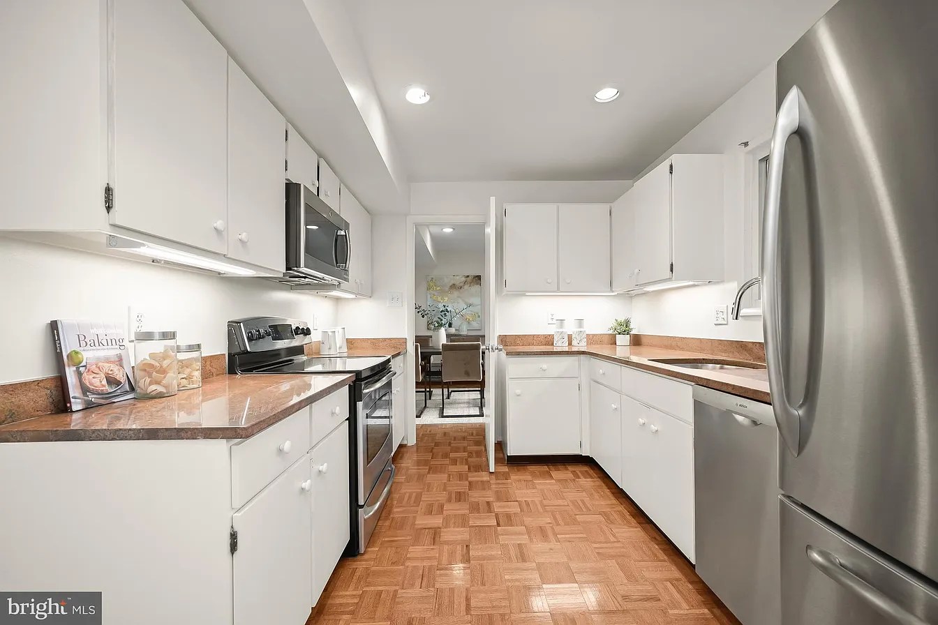
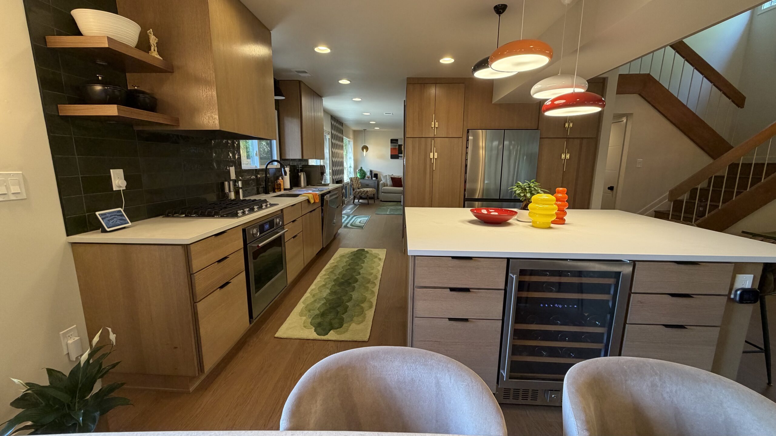
No room changed more than the kitchen. What had been a closed galley is now, rightfully, the heart of the house. Fully open to the living and dining rooms and, just as importantly, to Benson Boone, Olivia Dean, and other dinner party favorites playing through the Marshall speaker. A rotating cast of cooking music now keeps us company while we make dinner for ourselves and whoever happens to be coming over. And so far the guests have been pouring in.
The oversized island, now dotted with period-colored glass, has proven big enough for several people to cook, pour wine, gossip, and hover over the appetizers at the same time. We obsessed over clearances during the design, and it paid off. Even with eight people packed into the room, the detached L-shaped layout accommodates beautifully. Though usually any traffic jam is less about group cooking and more about my nieces elbowing their way toward the charcuterie while waiting for dinner, which, admittedly, is always late.
And the inaugural meal after construction? Wagyu steaks from Bethesda’s Organic Butcher paired with a fifteen-year-old Opus One Cabernet, which set a completely unreasonable opening night standard. But since then, we have broken the kitchen in properly with chicken cacciatore, fresh summer tomato and burrata pasta, and a full Argentine asado (basically an excuse to grill fifteen different types of meat). Since moving in it’s been a fun, steady rotation of dinner parties both intimate and crowded. Just the way we like it.
Before and Now – Kitchen
Comfort, Color, and Curious Coincidence
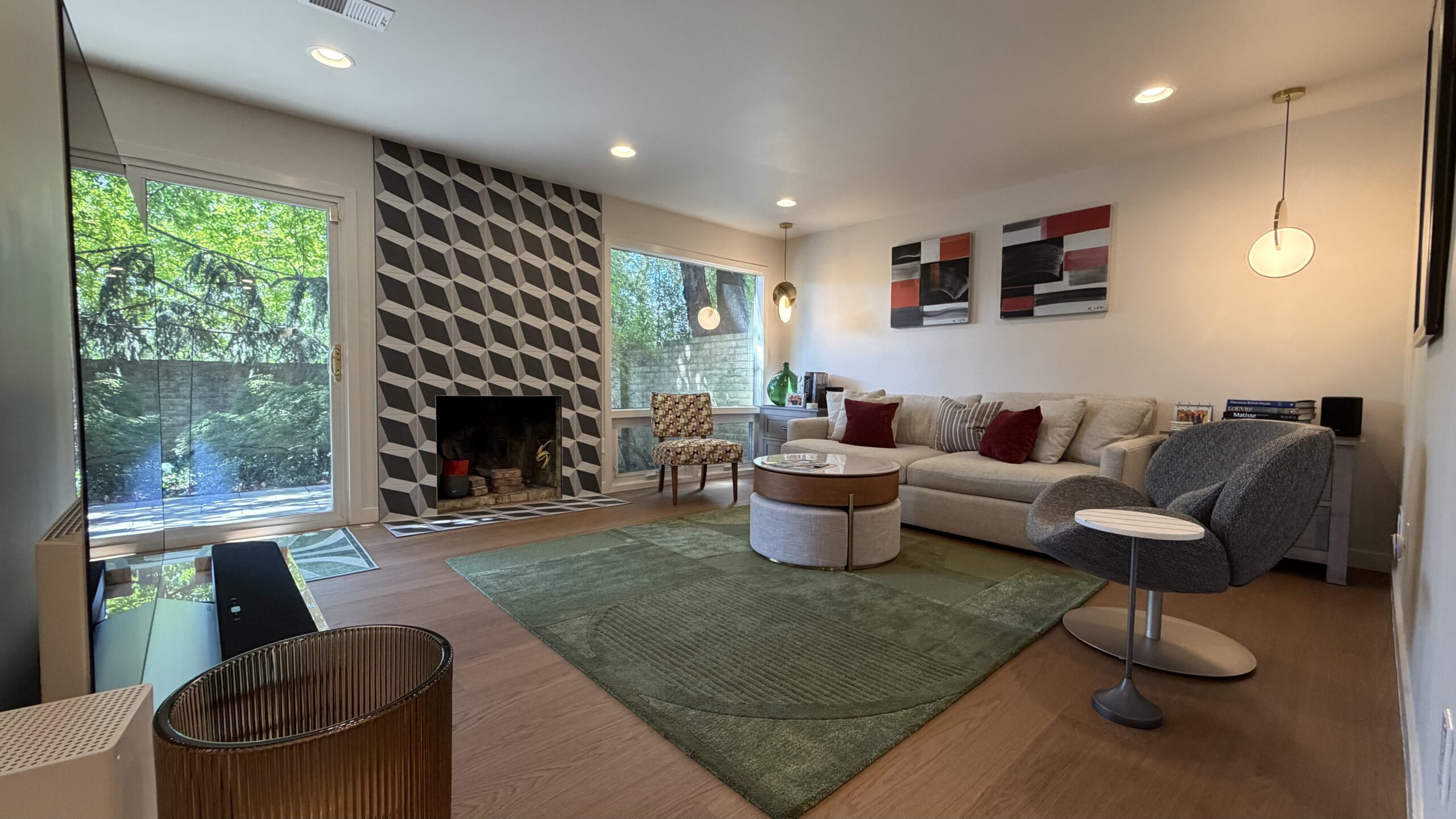
The family room came together with less reinvention than anywhere else in the house. We moved in our oversized Crate & Barrel sofa and two side chairs that had followed us through several homes, only to realize they were mid-century reproductions all along. One is a colorful contemporary take on the classic slipper chair, with tapered wooden legs and a bold geometric pattern. Opposite it sits a sculptural pedestal lounge chair with a rounded, retro-futuristic silhouette that owes more than a little to Arne Jacobsen’s 1958 Swan Chair. They fit so naturally it feels as though we somehow bought them with this room in their future.
A few other pieces were repurposed also. The side tables that once flanked our bed now sit beside the sofa, where they provide always-welcome storage. A new, stone-topped round coffee table with walnut and brushed brass base replace a high-maintenance industrial cement coffee table we said goodbye to in Crown (the annual waxing was painful). Another Safavieh rug in dark green pulls colors from the garden into the room.
The result is a family room that is softer and more relaxed than the living room, but it follows the same rule: use furniture with enough character to belong in the architecture, then stop before the room starts looking like a catalog of mid-century greatest hits.
And yes, that hole in the fireplace is intentional only in the sense that we are intentionally waiting until peak August heat to shop for a gas insert. Nothing says smart timing like buying a fireplace when everybody else is still shopping for swimming pools.
Before and Now – Family Room
Work, Wellness, & (What Else But) Wood
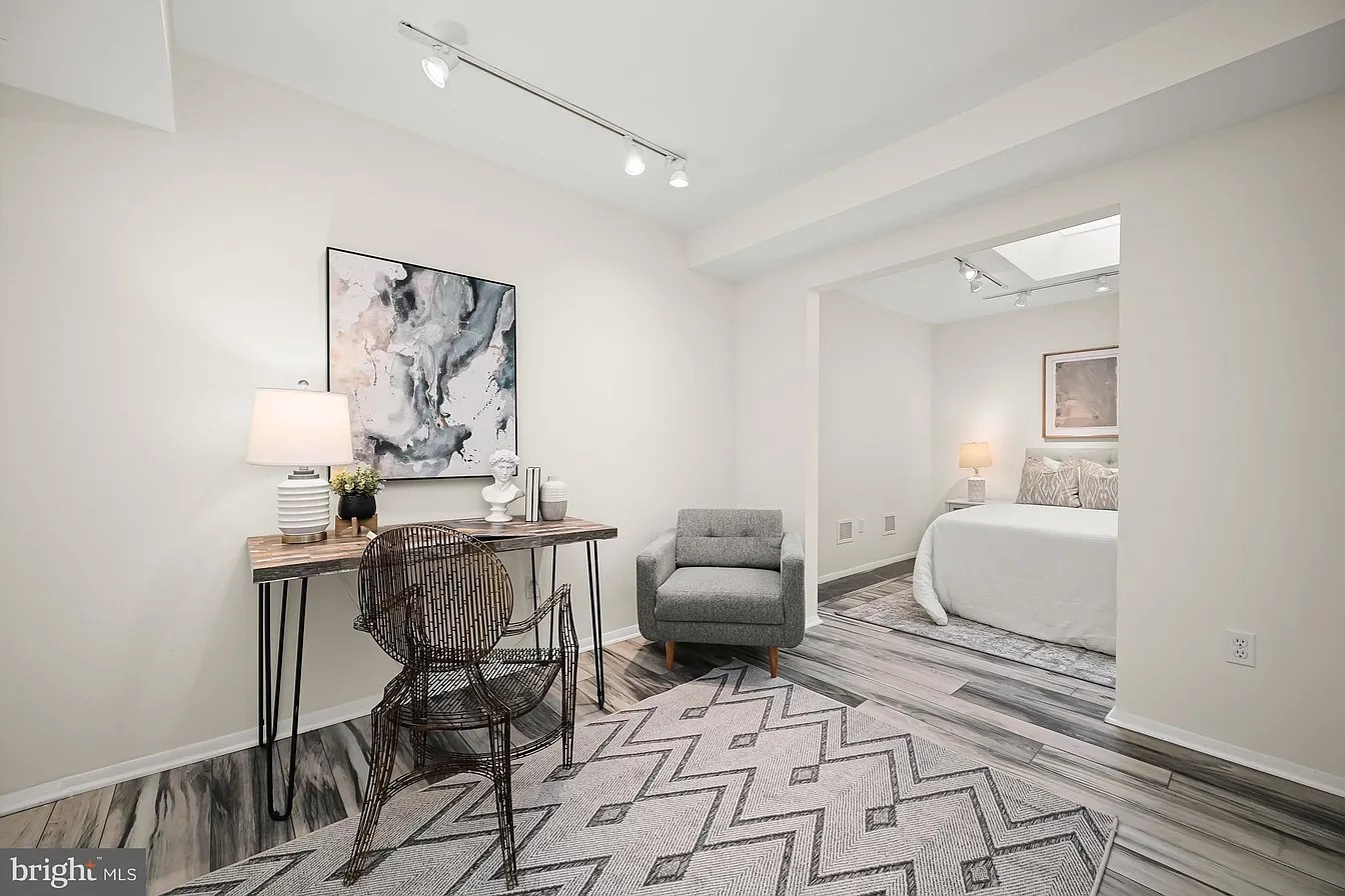
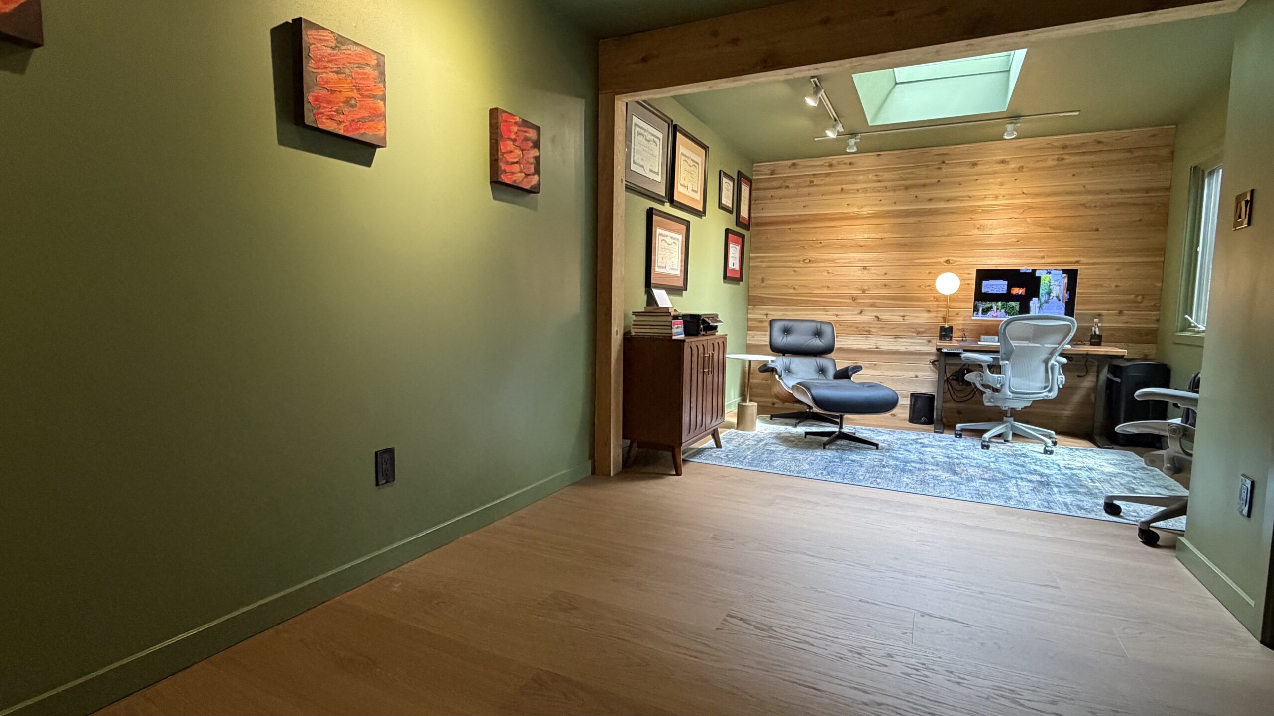
The office and yoga studio took more thought than expected because the room has to support two very different states of mind. In the morning, and again after a bike ride or run, it becomes our yoga studio. Morning yoga is about stretching, waking up, and mentally transitioning into the day; post-workout yoga is more restorative and meditative. During work hours, though, the same room becomes my office. I was not convinced that spreadsheets, conference calls, and spiritual restoration were natural roommates.
We also had to decide which end of the 25-foot room should belong to each use. The original staging put the office toward the front and a bed in the back, which would have placed the yoga area beside the large picture window overlooking the front garden. That sounded appealing until we considered how much natural light matters when working from home. There was also the practical benefit of being able to keep an eye on the approximately one million packages that seem to arrive at our door every day.
Ultimately, we flipped the plan and placed the office at the back beneath the skylight. The exposed beam and fresh-cut cedar wall create a natural visual break between work and wellness without physically dividing the room. A few new pieces of furniture helped soften the office side too. A fun and colorful Safavieh rug, an Eames chair that complements the existing Herman Miller office chairs, and a small walnut credenza topped with art books and the printer. The result feels less like an office invading a yoga studio and more like two distinctly different uses that surprisingly compliment more than just coexist.
Before and Now – Office
From Broken to Brilliant
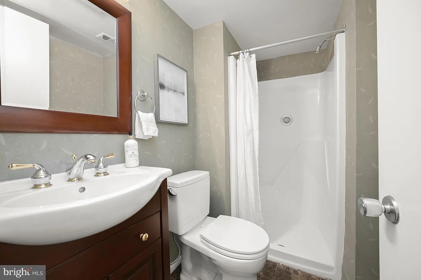
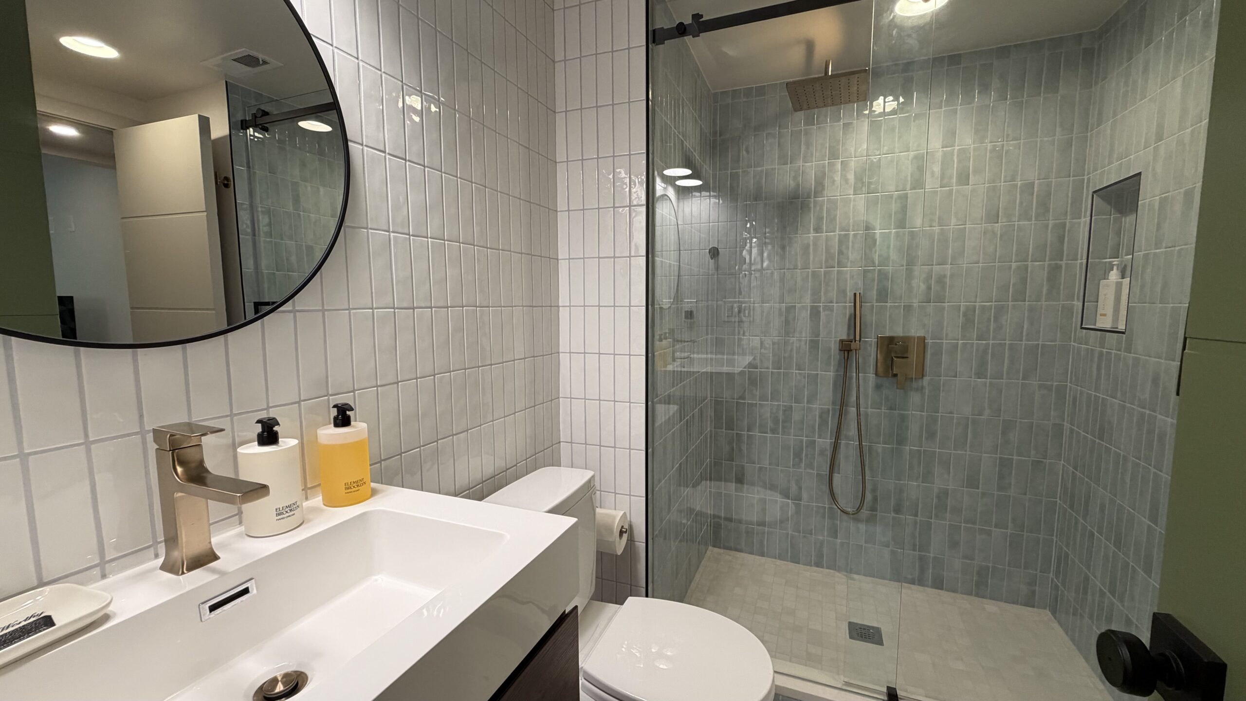
When we bought the house, the first-floor bathroom was already broken. The previous owners did not even attempt to disguise the missing shower head or the completely nonfunctional handle mounted on the back wall. Our inspector spotted both immediately, which led to a slightly absurd conversation in which we explained that he could pretty much ignore the plumbing, electrical, and HVAC—basically everything you hire an inspector to, well, inspect. His shock subsided once we explained that we were gutting the house and ripping it all out on day one. Ever the consummate professional, he documented every flaw anyway.
One thing I did like was the original round shower handle, even if turning it on—I can only assume back when it worked—would have guaranteed a cold, soaking wet arm. After widening the shower by three feet, we moved the controls farther to the right and installed a 20-inch square Delta rain head in champagne brass that sends the water straight down. Translation: your arm stays dry turning it on and the flow is less gentle rainfall and more fire hose. This shower blasts away sweat and grime from the hottest bike rides and outdoor runs almost as effectively as a Turkish hammam.
Also, every time I walk into the room I giggle when I think about our contractor’s construction conundrum. Each tile is handcrafted, which means no two are exactly the same size or shape. Our contractor, a former auditor, nearly lost his mind trying to work out how to make hundreds of individual pieces look perfect. Somehow, he did. Which I think could be the most satisfying audit result of his career. Quality is visible across the house, showcasing the precision and perfectionism of John and CJ at Woodpak Builders.
Before and Now – First Floor Bathroom
Velvet, Views, & a Very Convenient Bar
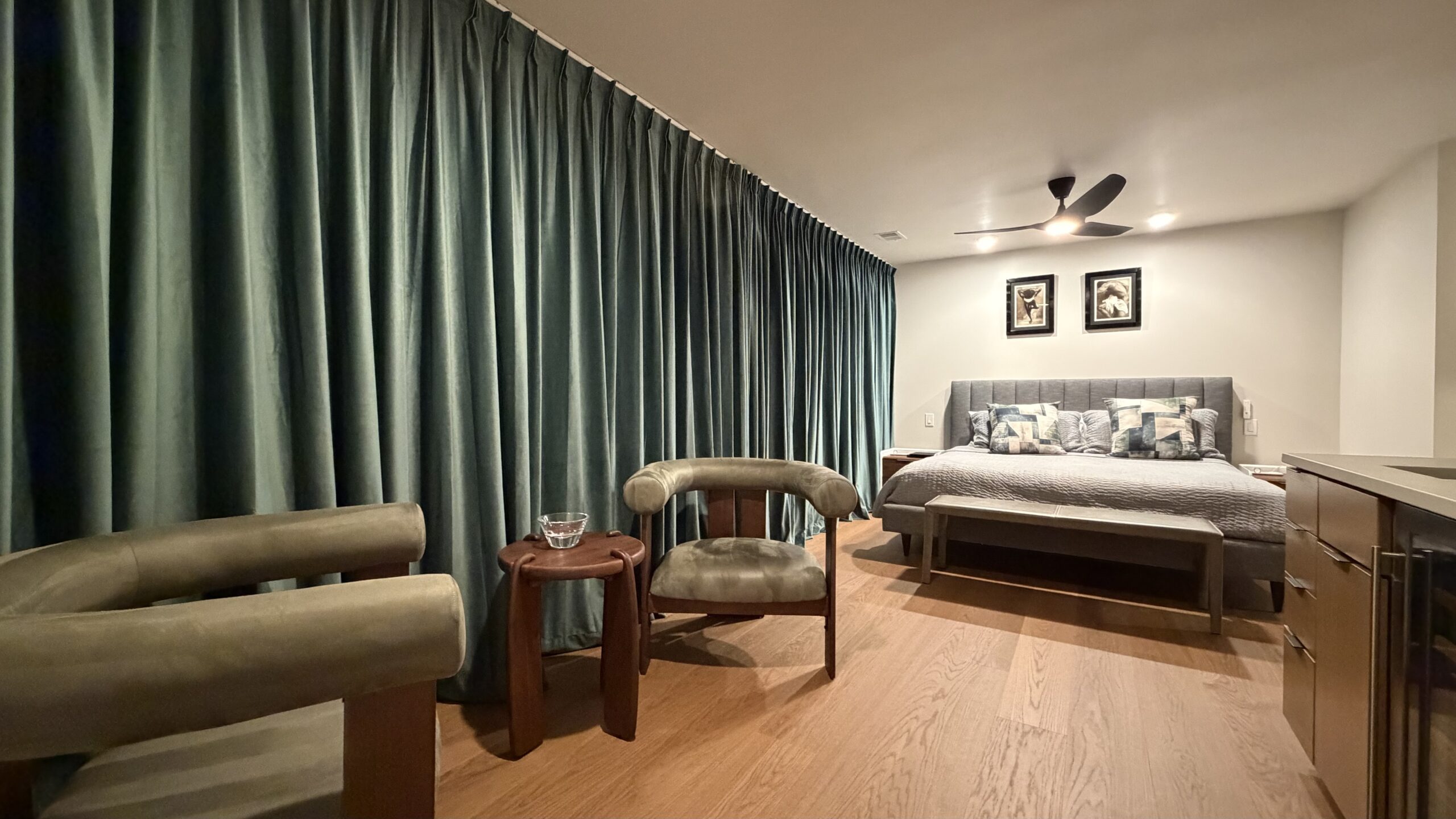
I have never owned a house with a champagne bar in the primary bedroom, or anywhere, for that matter. So once again we had a blank canvas, this time with a very specific goal: create a seating area for just the two of us that felt a little funky, but still calm.
I had my heart set on sage green as a subtle preview of the tile waiting just around the corner in the primary bathroom. I also wanted a strong wood element to echo the mature trees filling the view outside. Fortunately, Rove Concepts was having a sale on its Tola Lounge Chairs, which draw from the organic side of mid-century modernism with clear Brazilian and Scandinavian influences. We paired them with Rove’s walnut Orb side table, a small sculptural piece that nods to the rustic-modern work of Charlotte Perriand. Together, they gave us exactly the balance we wanted: calming color, warm wood, and relaxing retreat.
And then, some drama. Wall-to-wall turquoise crushed velvet curtains run on a ceiling-mounted track, instantly making the room feel like a private theatre. Outside, a wide brick chimney pushes the two large picture windows all the way to the outer edges of the rear bedroom wall, leaving no room for traditional pairs of panels that open on both sides. So instead of four curtains opening 50/50, we decided on two oversized panels that open only toward the center of the room. When pulled open, they create an unexpected velvet divide between the sleeping area and the champagne bar seating. A playful partition with plenty of personality.
Before and Now – Primary Bedroom
Closets, Coordination, & Easy Mornings
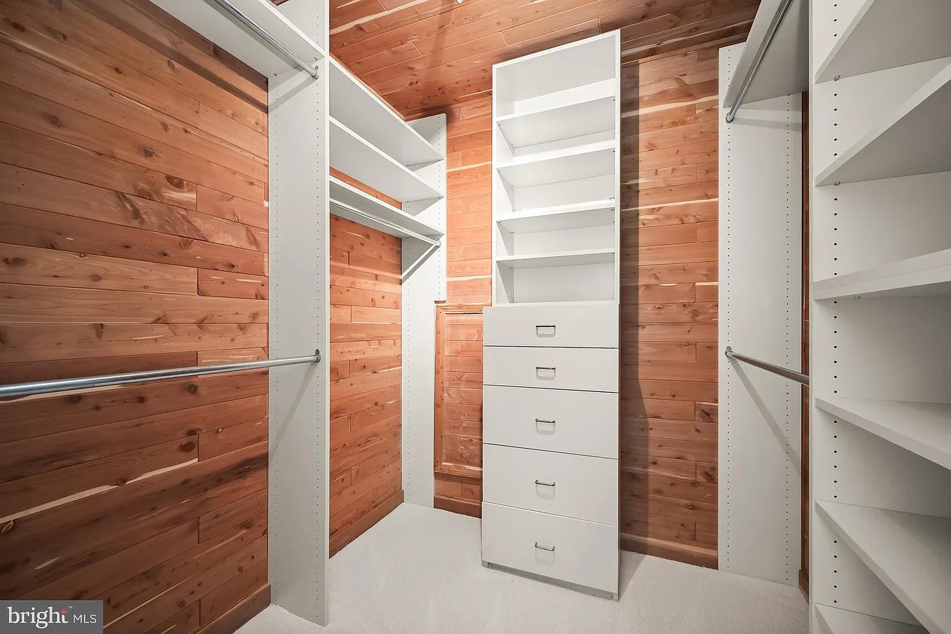
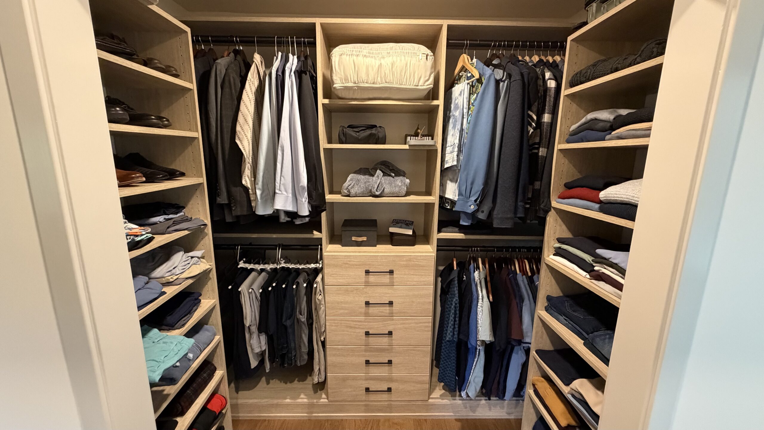
The EasyClosets systems exceeded our expectations once again. This is our third house using the D.I.Y. system, so by now we have pretty much mastered both the not-entirely-intuitive design website and the self-installation process. Replacing one shared closet with two matching closets, one for each of us, delivered an immediate benefit: no negotiating over who gets the fifth drawer. The layouts are exact mirror images, with a mix of hanging space, drawers, and open shelving tailored to our wardrobes. I think we may have finally achieved closet perfection.
My most-used feature is the valet bar. I have less than zero decision-making capacity first thing in the morning, and even less before an early flight. Having an outfit chosen the night before and hanging there ready to go saves me from standing half wet and half awake in front of a wall of clothes, staring into the abyss while inspiration remains at least two cups of coffee away.
The closets also capture one of the broader goals of the renovation: use every square foot intentionally. They are not the kind of closets you would see on MTV Cribs, but they do exactly what we need them to do—and still leave plenty of empty shelves for future shopping. Thinking about it, that may be the only real design flaw. But we can debate that next time we are standing inside Galeries Lafayette Haussmann in Paris.
Before and Now – Dual Primary Bedroom Closets
Skylights, Sage, & Shared Showers
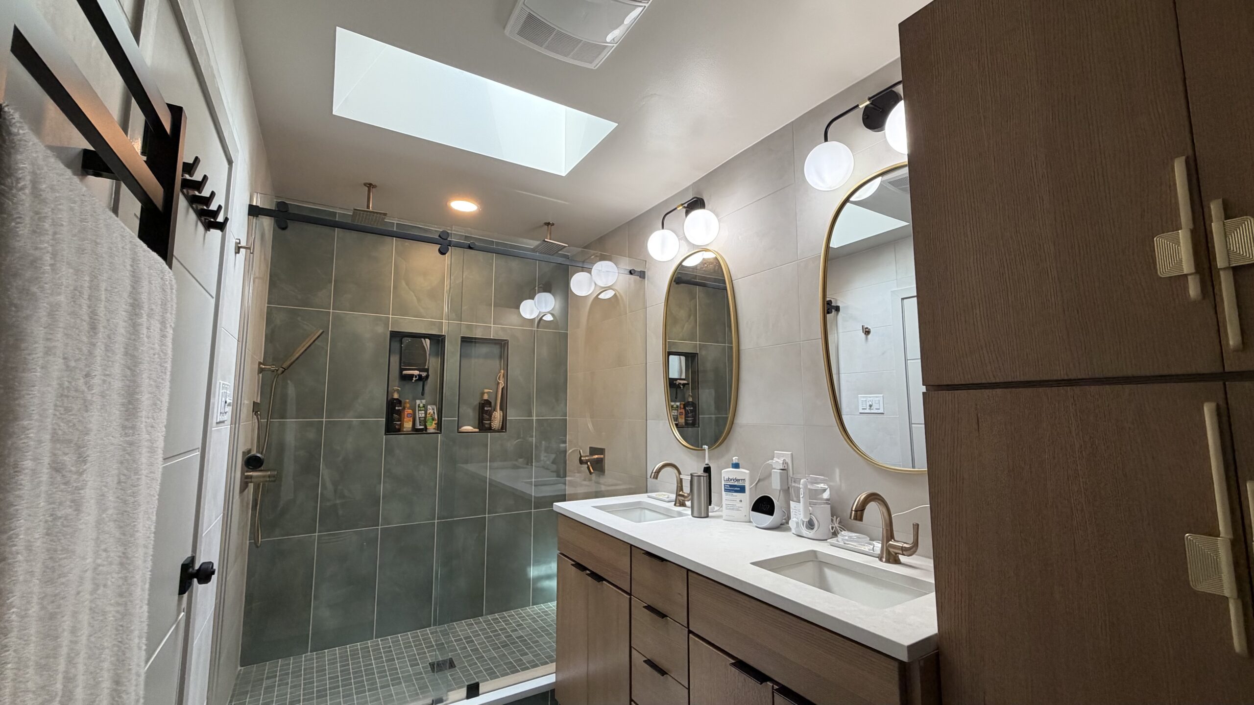
The primary bathroom is now fully settled in, and the material choices make even more sense in daily use. Matte tile wraps the floors and walls, softening the bright sunlight pouring through the skylights instead of bouncing it back at us from every surface. Other small decisions have proven equally useful. We added outlets inside the oversized linen closet, which means bulky everyday items like the hair dryer remain plugged in and ready to use yet completely out of sight.
The most-used feature here is definitely the dual ceiling-mounted shower heads. We had dual showers in our previous Bethesda house, lived without them in Crown, and were reminded very quickly why we wanted them back. I am not interested in living anywhere we cannot shower together, regardless of where we end up next. We now take more showers together than apart, which saves time and comes with more than a few additional benefits that require no architectural explanation.
Before and Now – Primary Bathroom
Tile, Tub, & Thoughtful Touches
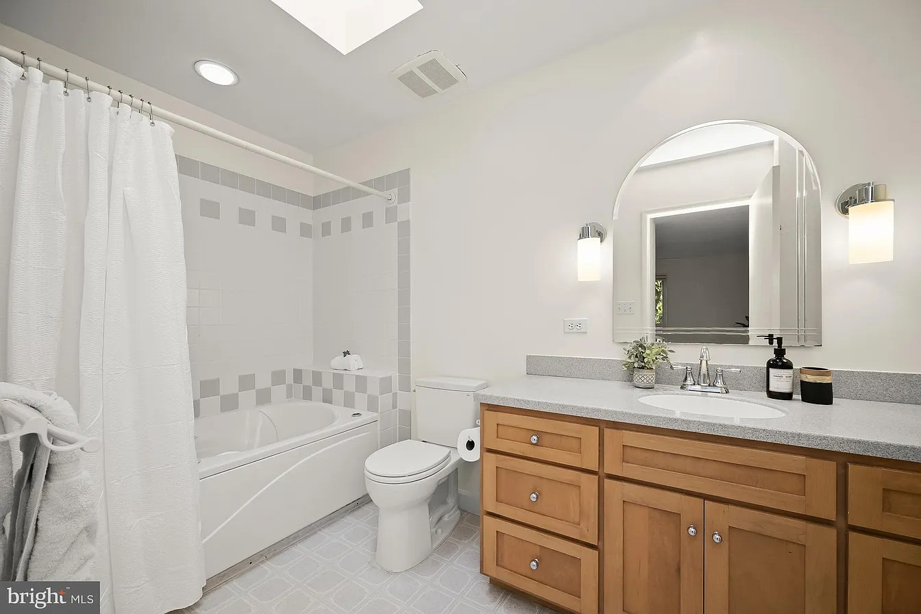
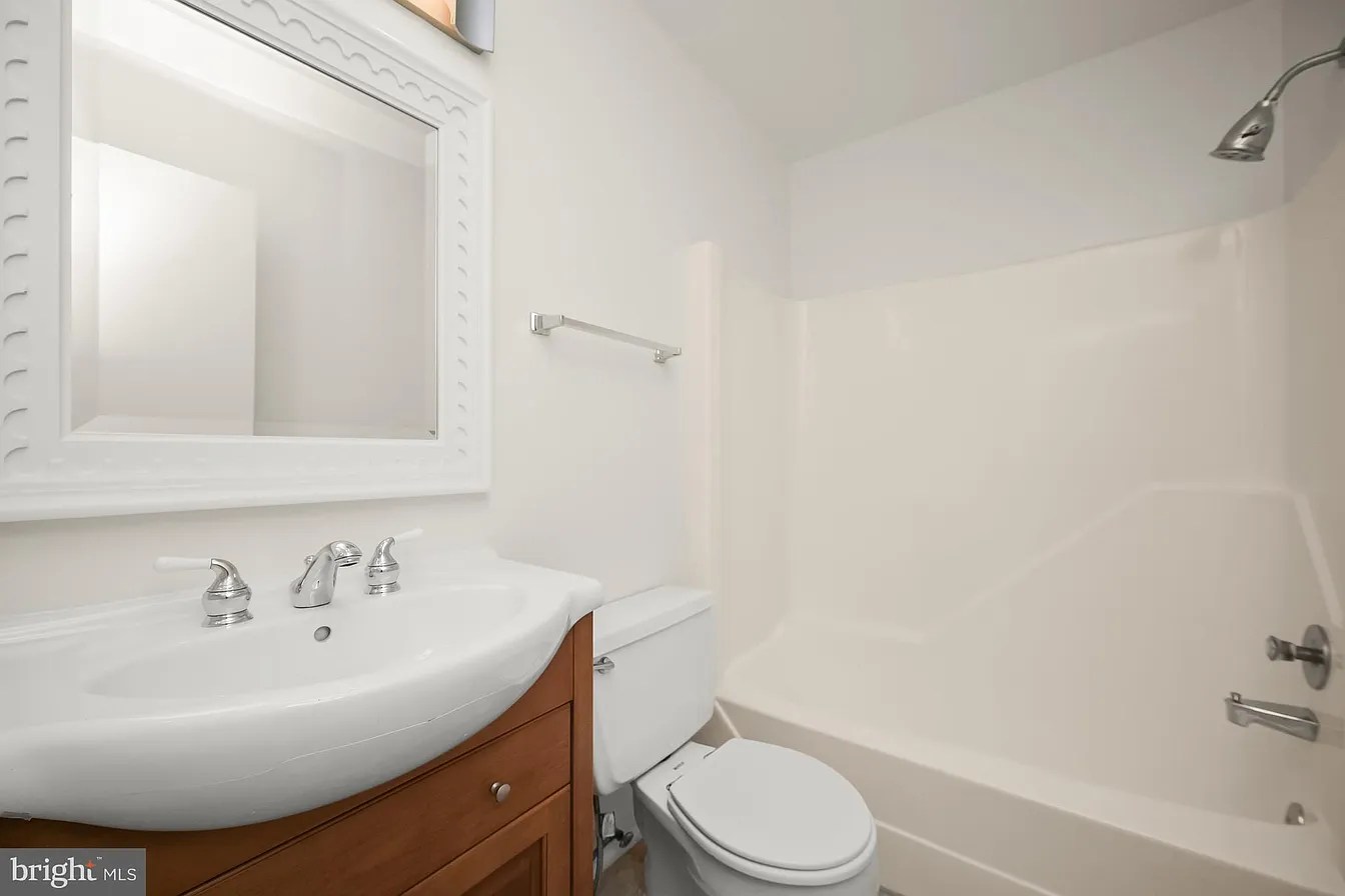
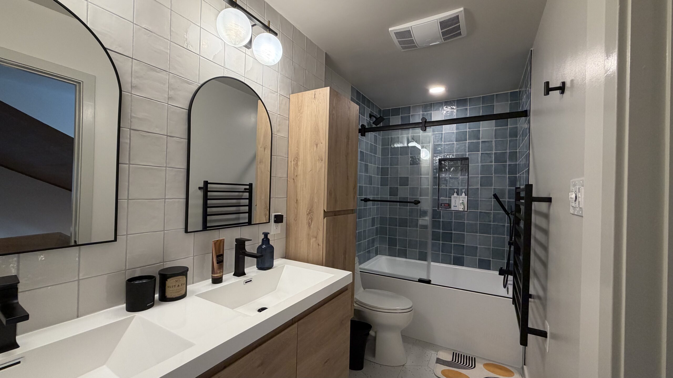
Several overnight guests have now broken in the guest bathroom and noticed the small details we chose to make the space feel more luxurious. Widening the room four feet provided space for dual sinks and a dedicated storage closet, now fully stocked with guest toiletries and towels, is the first thing people notice. Then, staying more than a night, they also discover the towel warmer, the hand shower wand, and the main shower head mounted on the opposite wall from the controls. Because really, who wants a wet arm before the shower is even warm?
Most everyone also comments on how bright the room feels. With no natural light, we chose high-gloss wall tile to reflect as much light as possible without having to double down on lighting. On the floor, we did the opposite, replacing the shiny 1960s linoleum with honed terrazzo tile. A bright white base keeps the room feeling light, while the textured finish adds the traction needed to keep guests upright, a reasonable design objective for a bathroom.
Before and Now – Upstairs Guest Bathroom
Reuse, Refresh, & Repeat
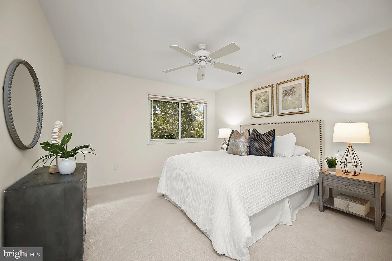
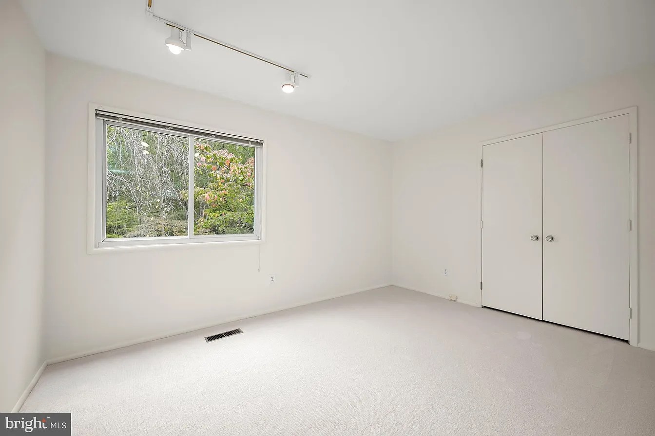
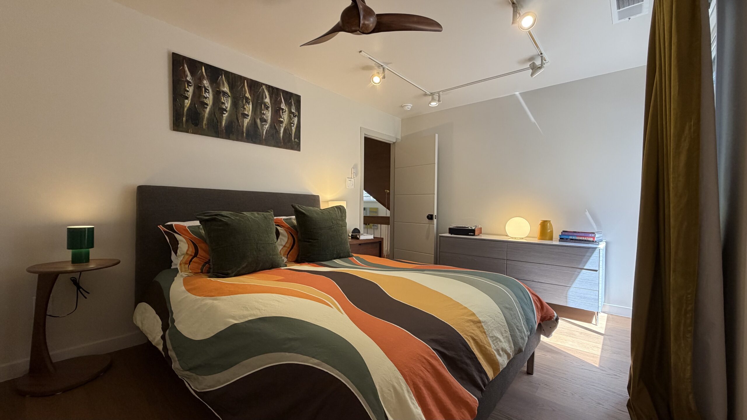
The far guest bedroom became an exercise in reuse. Nearly every piece of furniture had lived somewhere else in one of our previous houses, and I worried that bringing it all together would make the room feel like a crowded consignment shop. Instead, the pieces somehow found a second life here. Even the dresser, which once served as a dining room credenza, fits perfectly and pairs well with the bed, the marble top continuing that theme from other rooms.
The biggest change here was the bedding. I wanted something far more colorful, but still rooted in natural tones and mid-century design. A bedspread with wavy geometric shapes and a period-inspired palette gave the room exactly the refresh it needed. Deep-gold velvet blackout curtains add another layer of color and provide continuity with the other bedrooms.
Artwork picked up at a market outside Lagos, Nigeria, brings in even more warmth and color, while the wood blade ceiling fan adds a final natural element overhead. The result feels more meaningful rather than matched—colorful, cohesive, and confidently contrasting. Which is probably the best outcome for a room assembled almost entirely from repurposed furniture.
Before and Now – Far Guest Bedroom
Bouclé & a Bright Bed
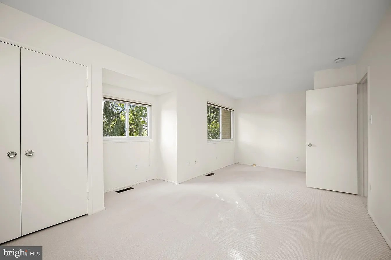
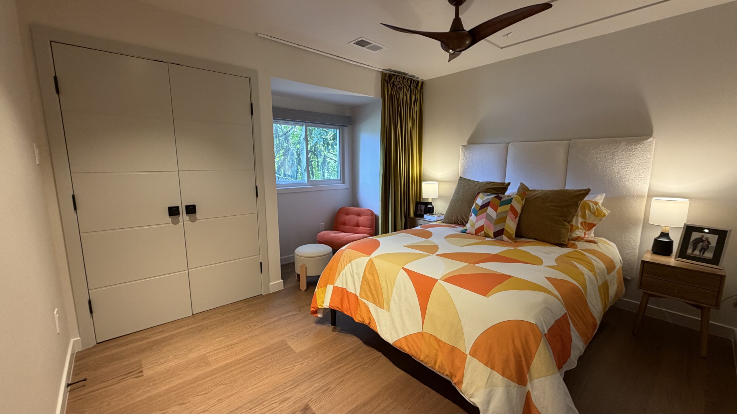
The middle guest bedroom was our last completely blank canvas, and it came with one very specific challenge. Moving the HVAC into the attic gave us a much better first-floor bathroom and, importantly, a dedicated shoe closet: every gay’s dream. But it also meant creating code-compliant attic access for future servicing. The most logical location happened to be directly above the bed.
I was unwilling to let functionality wreck the room, so I put my Marriott experience to use and asked a simple question: what would a W Hotel do? The answer was a wall-mounted headboard in French almond bouclé paired with a detached bed frame that can roll easily out of the way whenever the attic stairs need to come down. Petite Nathan James nightstands fit neatly on either side and, just as important, do not have to be moved when the fold-away steps are pulled down. My favorite detail is the sightline from the doorway. The bedroom sits off the cantilevered hallway overlooking the living room, so from one spot you can see the almond bouclé headboard and the Womb chairs below, visually pulling the two spaces together.
For the bedding and reading chair, we went deliberately bright, building the palette around a pillow we impulse-bought in a store. Gold from the velvet curtains, shades of orange and yellow, and small hits of turquoise all come together in something that feels like an autumn sunset. Guests can experience the real version too, assuming they resist the temptation to close the velvet blackout curtains. The result is warm, playful, and considerably less like a motel room designed by a cost committee.
Before and Now – Middle Guest Bedroom
Restored, Reimagined, & Ready for Real Life
From the beginning, the goal was never to return the house to 1970. It was to restore the ideas that made it special in the first place, then make them work for the way we live now. We opened rooms that had never been integrated, rebuilt the connection between inside and outside, restored clean lines and unifying natural materials. We modernized everything behind the walls, and tried to make every design decision serve both form and function. Preservation, yes. Time capsule, absolutely not!
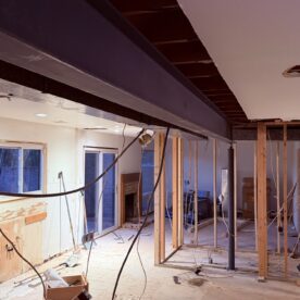
Looking back, the biggest victories are not necessarily the most obvious ones. The 26-foot steel beam transformed the floor plan, but the real payoff is being able to cook while talking to people in the living room. Moving mechanical systems gave us better rooms, but also made the house quieter, more efficient, and easier to live in. Floor-to-ceiling windows once again frame the gardens instead of disappearing behind curtains. Even the furniture colors and materials were chosen to reinforce the same basic idea: bring nature in, keep sightlines open, and create space for people to spend time together.
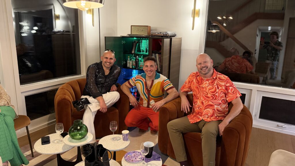
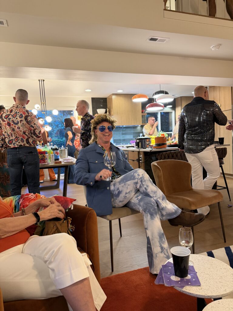
And apparently they do. We officially broke in the house with a 1970s costume party, filling it with friends, food, vinyl, questionable polyester, and enough people moving between the kitchen, living room, dining room, and garden to finally test everything at once. Everything worked, and, most importantly, people stayed. Late.
After five months of renovation, that may be the best measure of success. We did not just restore a mid-century house, we reimagined it for modern life. And ended up with a special space designed perfectly for us now and future families who appreciate timeless design.